
year
2025
year
2025
timeframe
3 weeks
timeframe
3 weeks
industry
E-Commerce
industry
E-Commerce
category
B2C SaaS
category
B2C SaaS
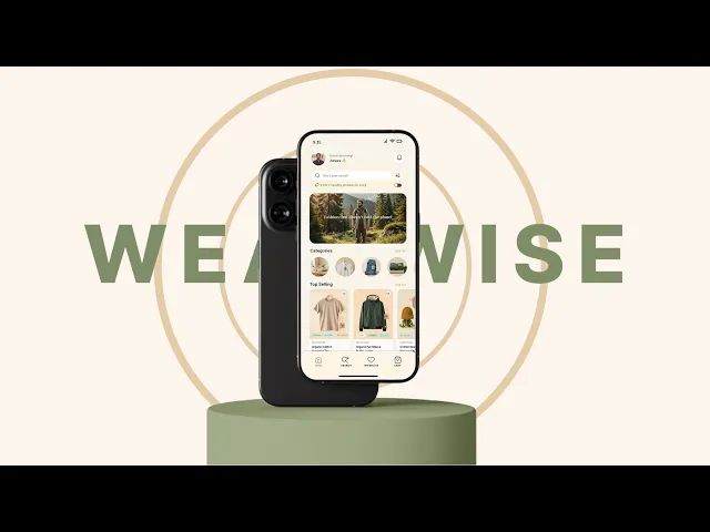
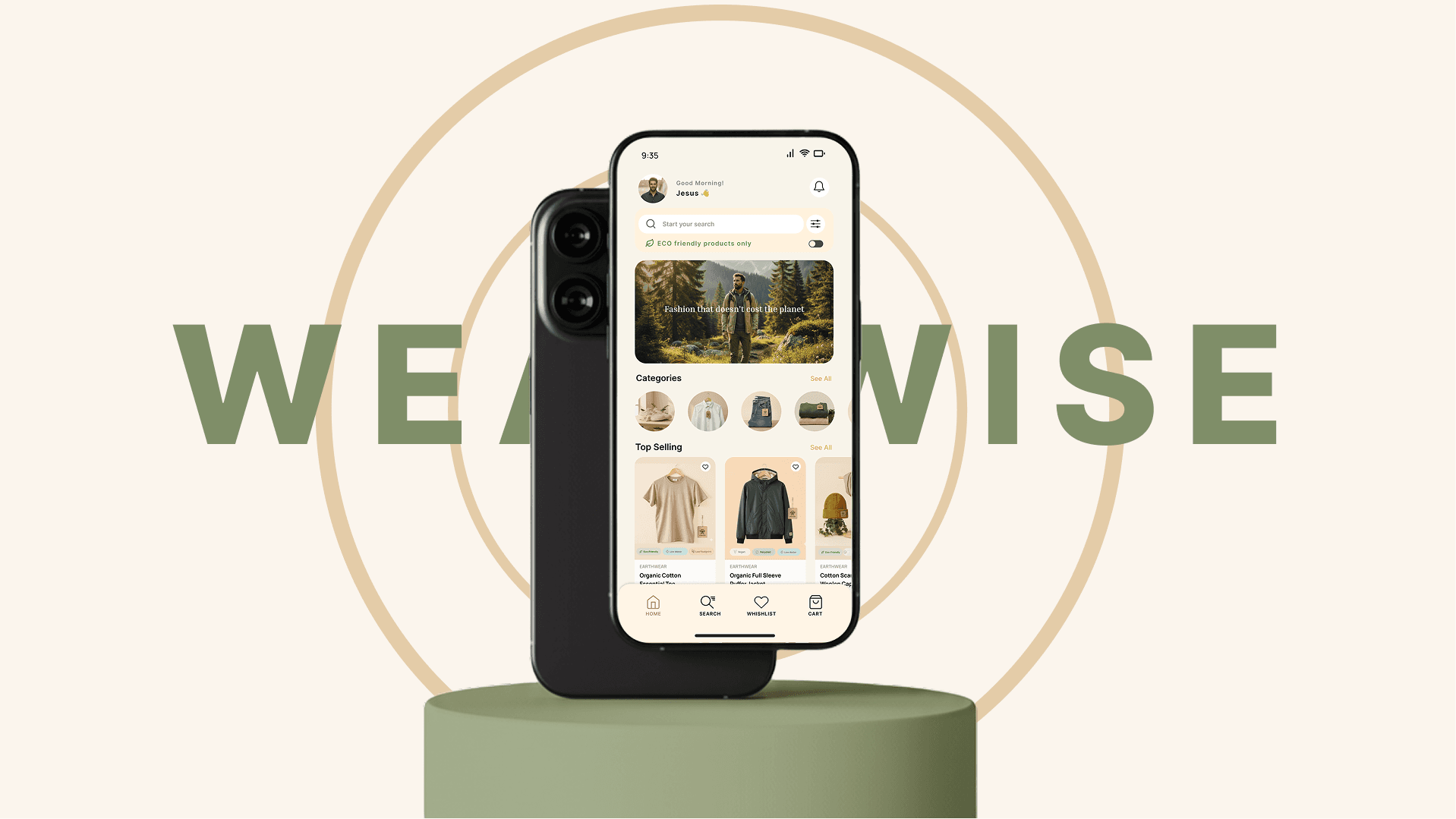
A sustainable clothing app that helps eco-conscious users to make informed purchases by presenting sustainability information in a easy way.
WEARWISE
Project headline
Simplifying sustainable fashion decisions
Context
E-commerce · B2C · Mobile / Web
Role
UX/UI Designer · Systems → UI
The Project Overview
Wearwise started from a simple tension I noticed in sustainable fashion: people want to shop responsibly, but the experience often feels confusing and heavy.
Working along with my teammate, I designed Wearwise as a mobile-first fashion marketplace that makes sustainability easier to act on without changing how people normally shop.
As part of our bootcamp project working as UX/UI Designer, we owned the project end-to-end — from research and system design to the final interface.
The Problem Definition
While sustainability information is everywhere, it often increases cognitive load instead of reducing it.
Labels like “eco,” “green,” or “conscious” feel vague and marketing-driven, making comparison difficult.
Users want to make sustainable choices, but uncertainty and distrust leads to hesitation and abandoned purchases. So, The core problem became clear:
"How do we support users in making sustainable decisions without slowing them down or making shopping feel complicated?"
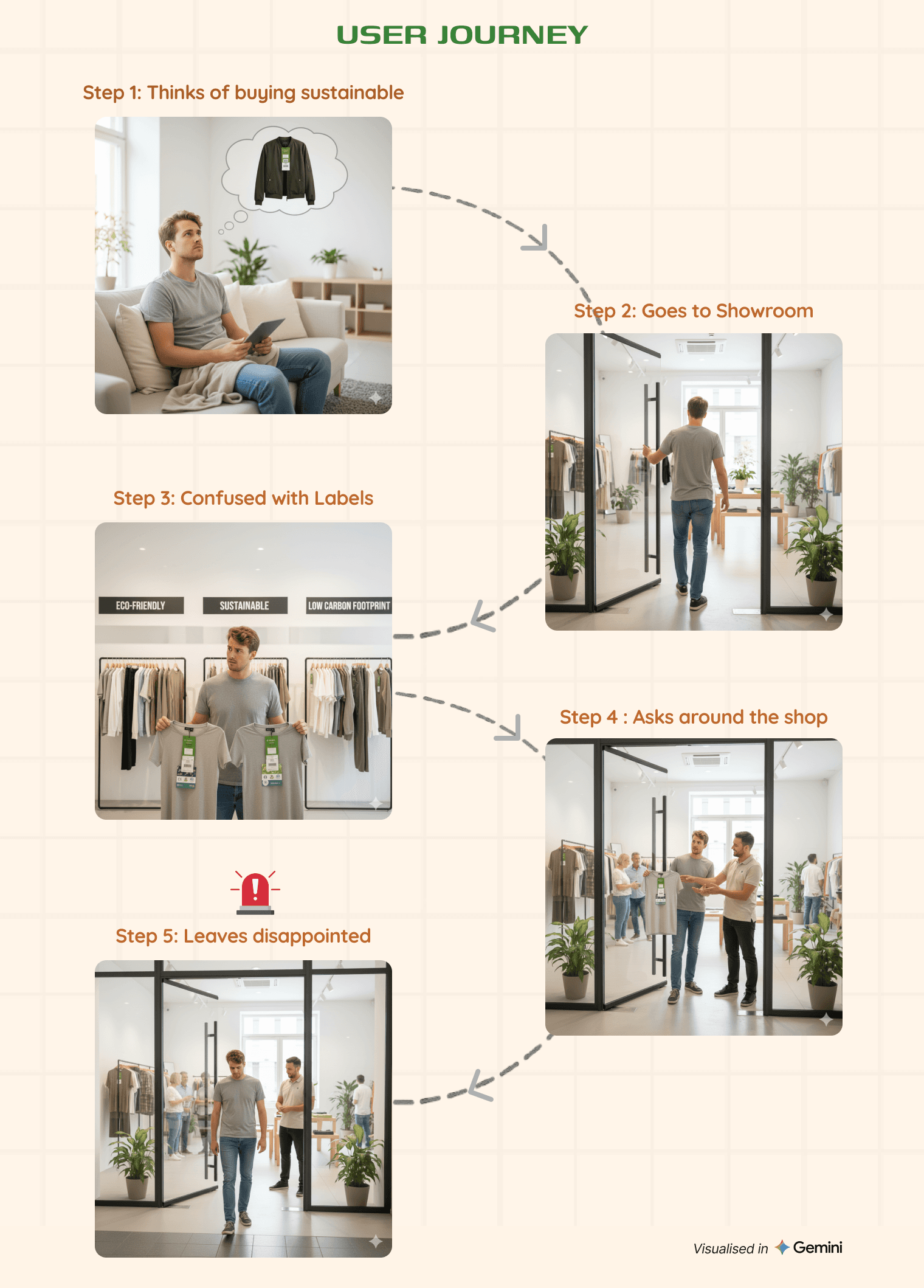
The User Journey
Mapping the journey showed a clear breakdown point. Users entered with good intent, tried to interpret sustainability labels, began comparing without context, and slowly lost certainty.
Instead of moving forward, they paused — and often exited without purchasing. The issue wasn’t motivation, but decision paralysis during product discovery.
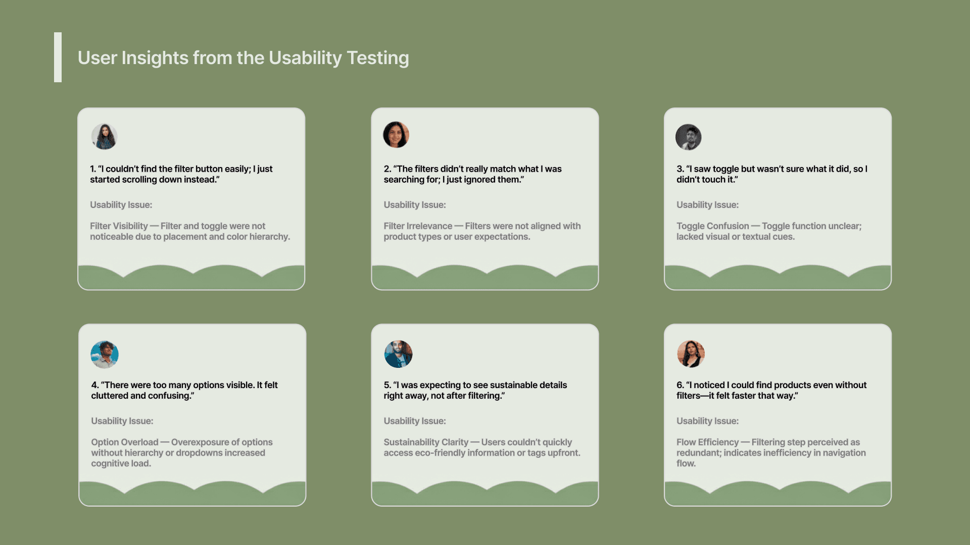
The Research Process
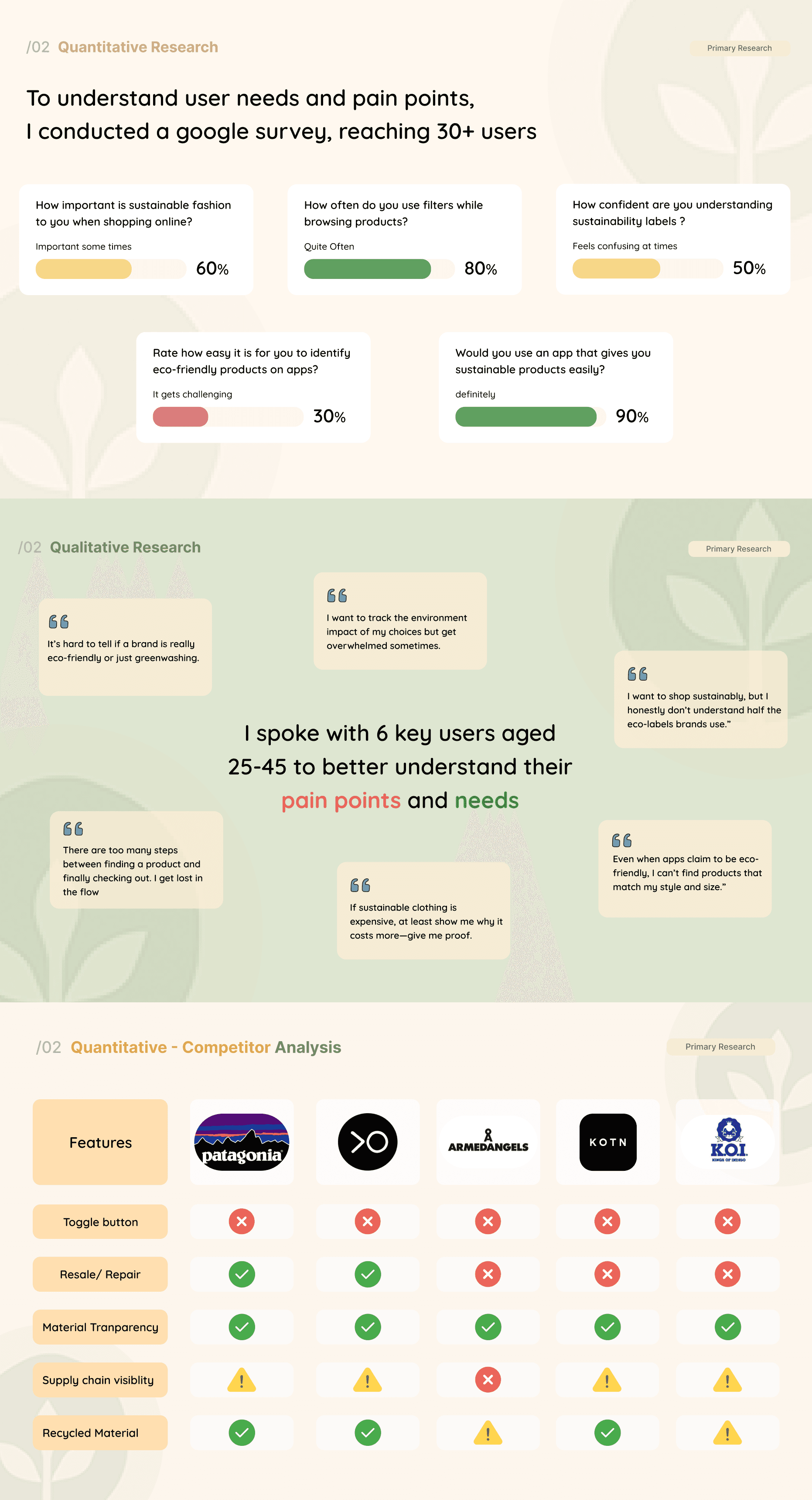
To validate whether this confusion was real, I worked in a team of two and conducted a quantitative survey with 30+ respondents, followed by 6 in-depth interviews.
We also analyzed 5 major fashion and sustainability platforms to study how sustainability information is currently presented.
Across methods, the same pattern emerged — users cared, but didn’t know how to act with confidence.
The Opportunities Discovered
Research revealed that users didn’t want to be educated while shopping. They wanted clarity, control, and speed.
Sustainability needed to behave like a preference — not a lesson. If users could define what sustainability meant to them, confidence and momentum could return to the shopping flow.
The Decisions Taken
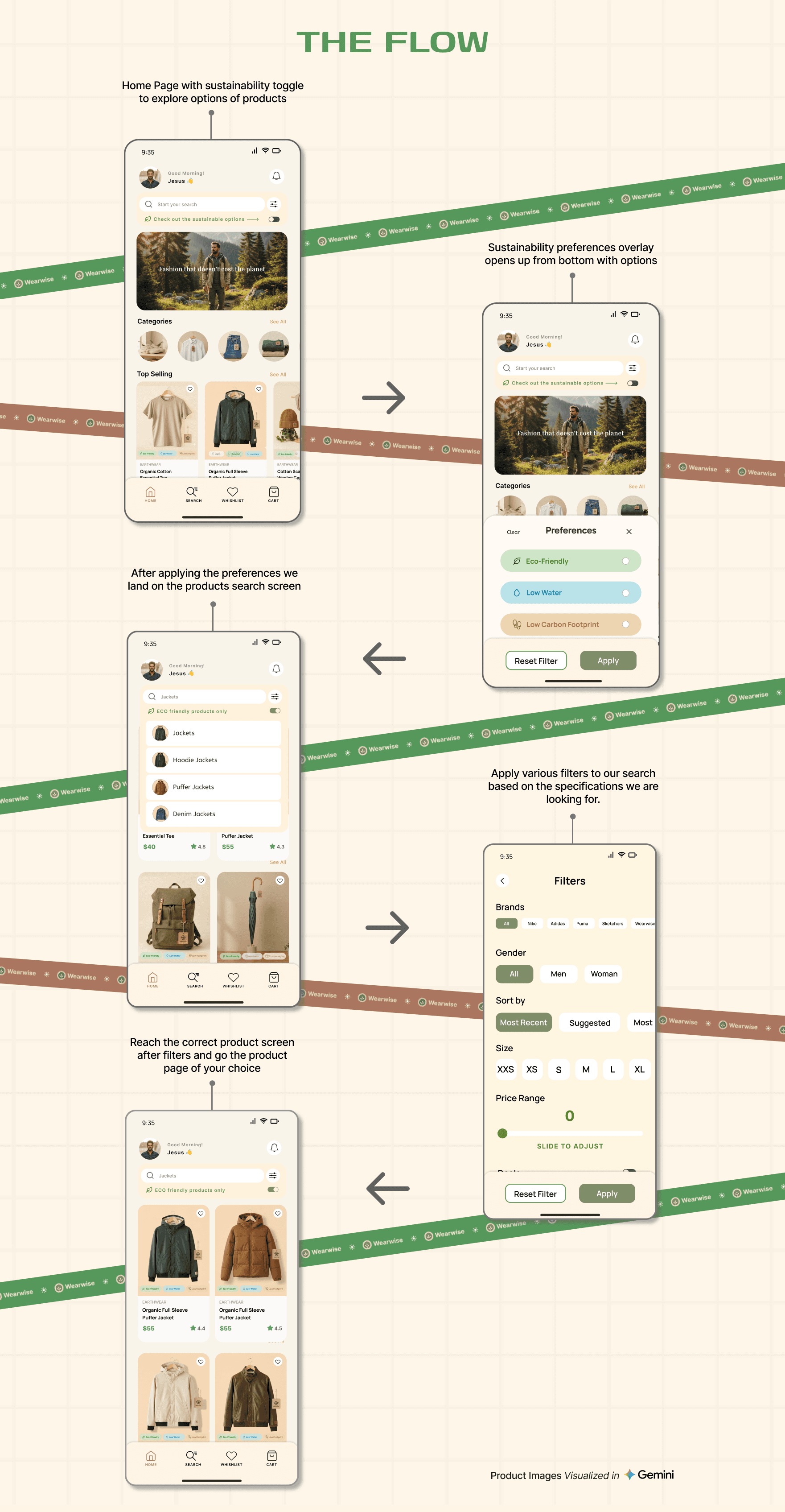
Based on this insight, we designed Wearwise as a decision-support layer within a familiar e-commerce experience.
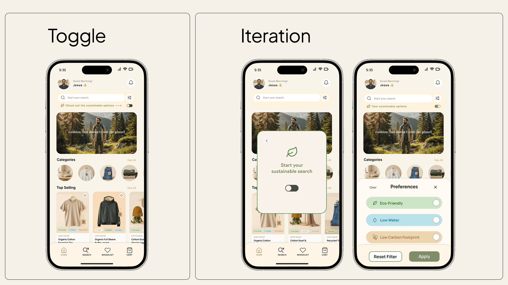
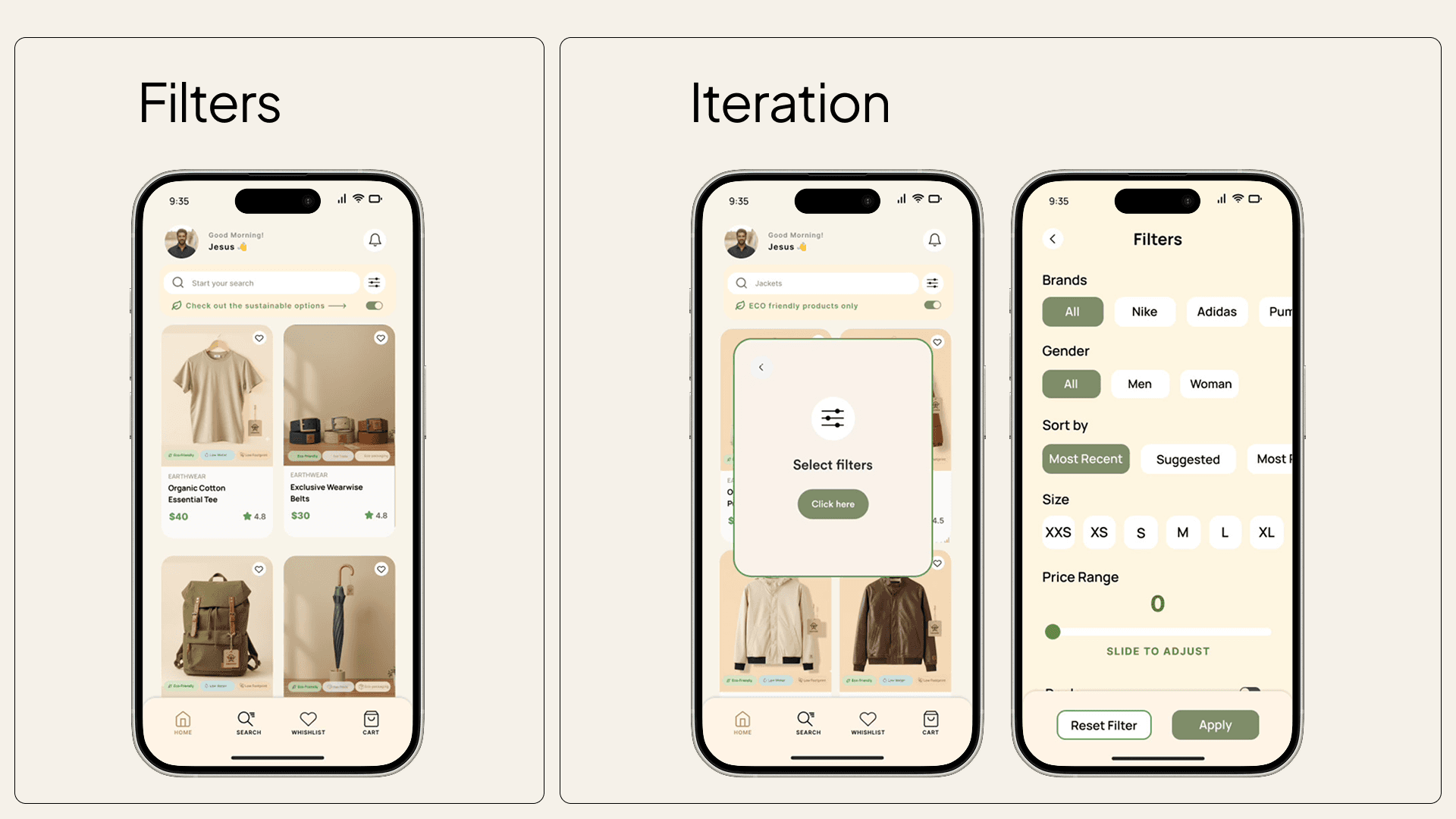
A sustainability toggle was placed directly below search, opening a simple overlay where users could select preferences like eco-friendly materials, low water usage, or low carbon footprint.
These preferences integrated seamlessly with existing filters like price, brand, material of product.
The Experience Created
The experience feels like any modern fashion app first. Sustainability stays visible prominently on the Home screen.
Once activated, it becomes clear, actionable, and comparable — guiding better decisions without interrupting shopping momentum.
Users remain in control, and sustainability supports decisions rather than slowing them down.
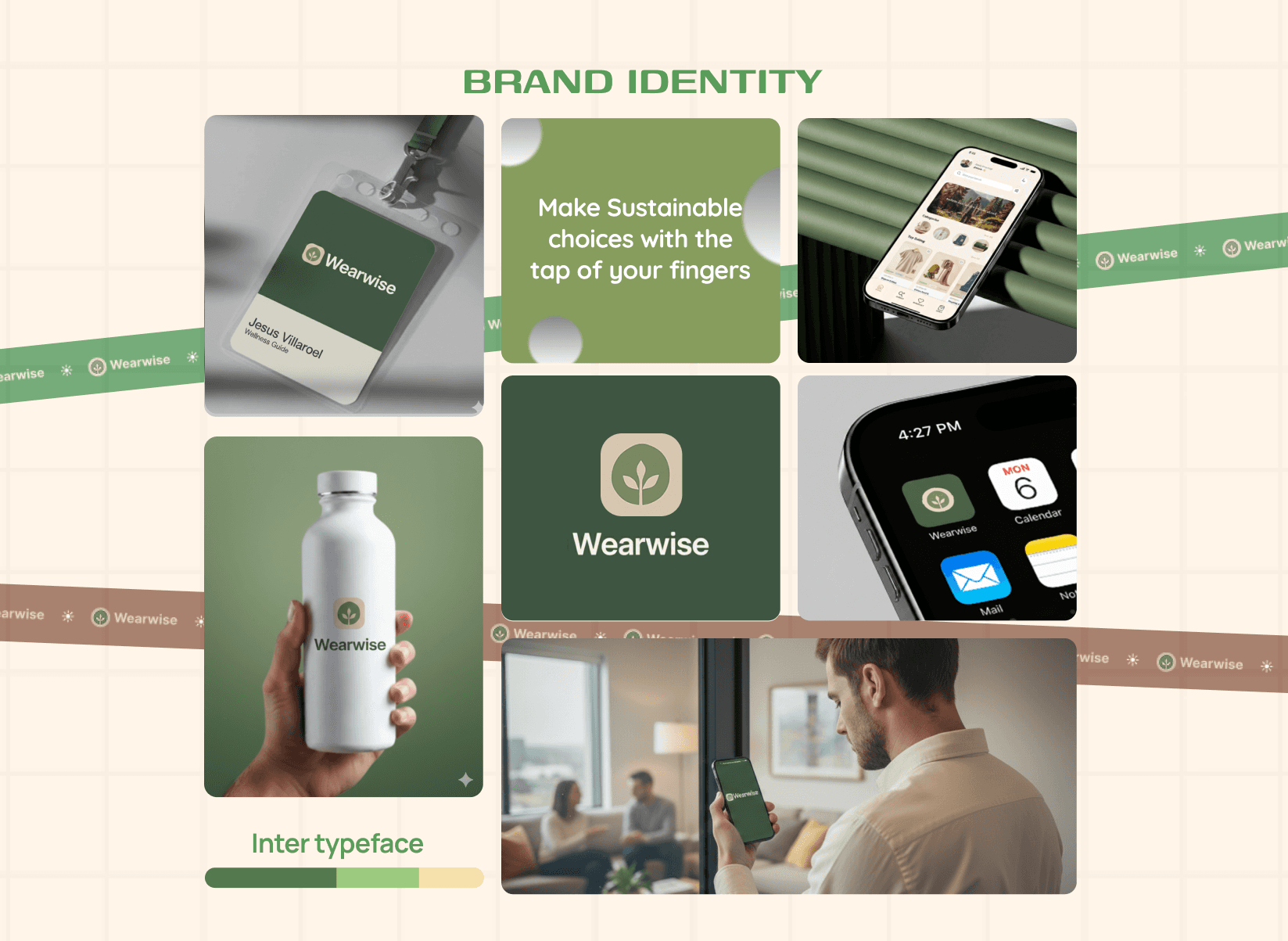
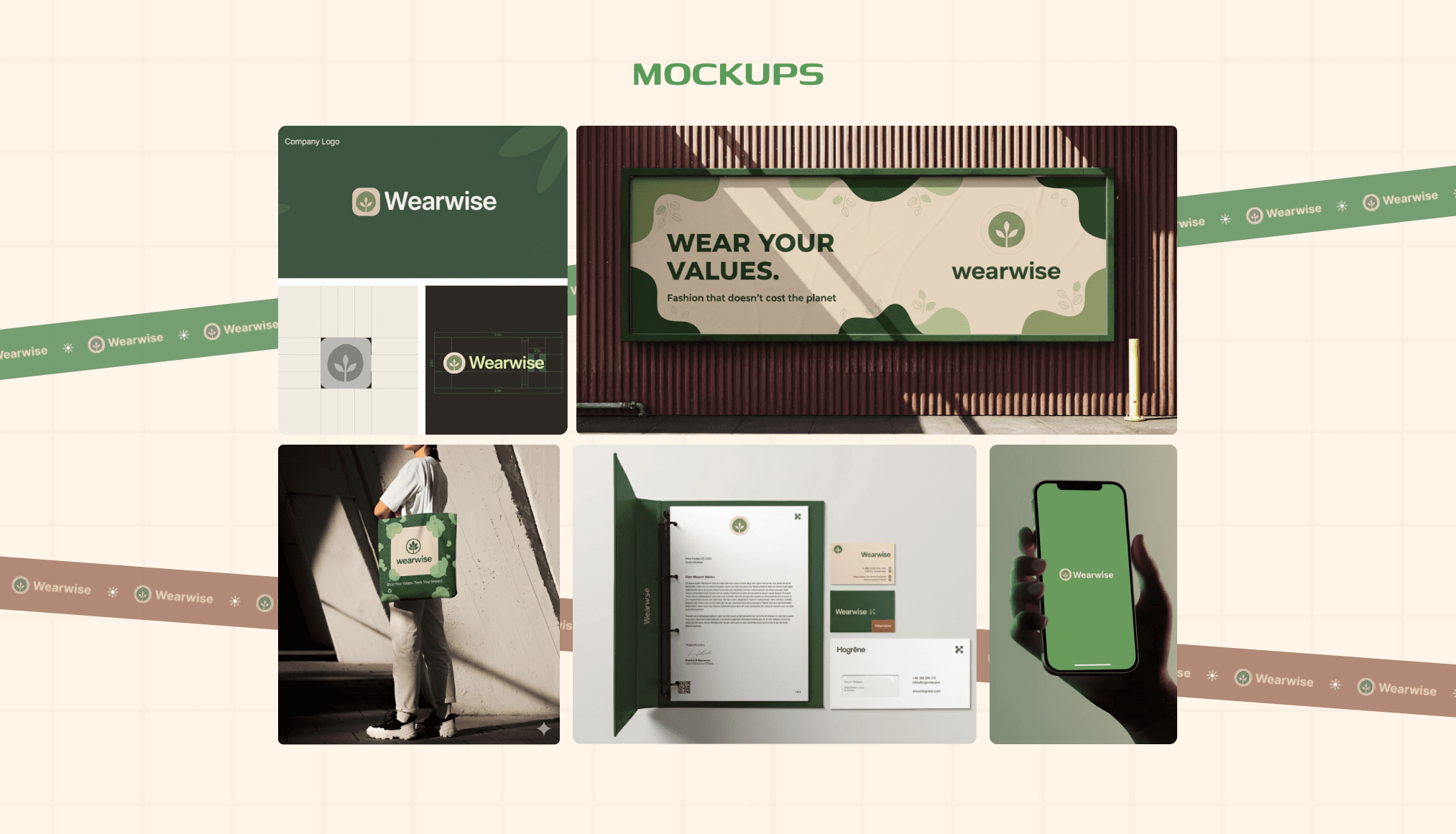
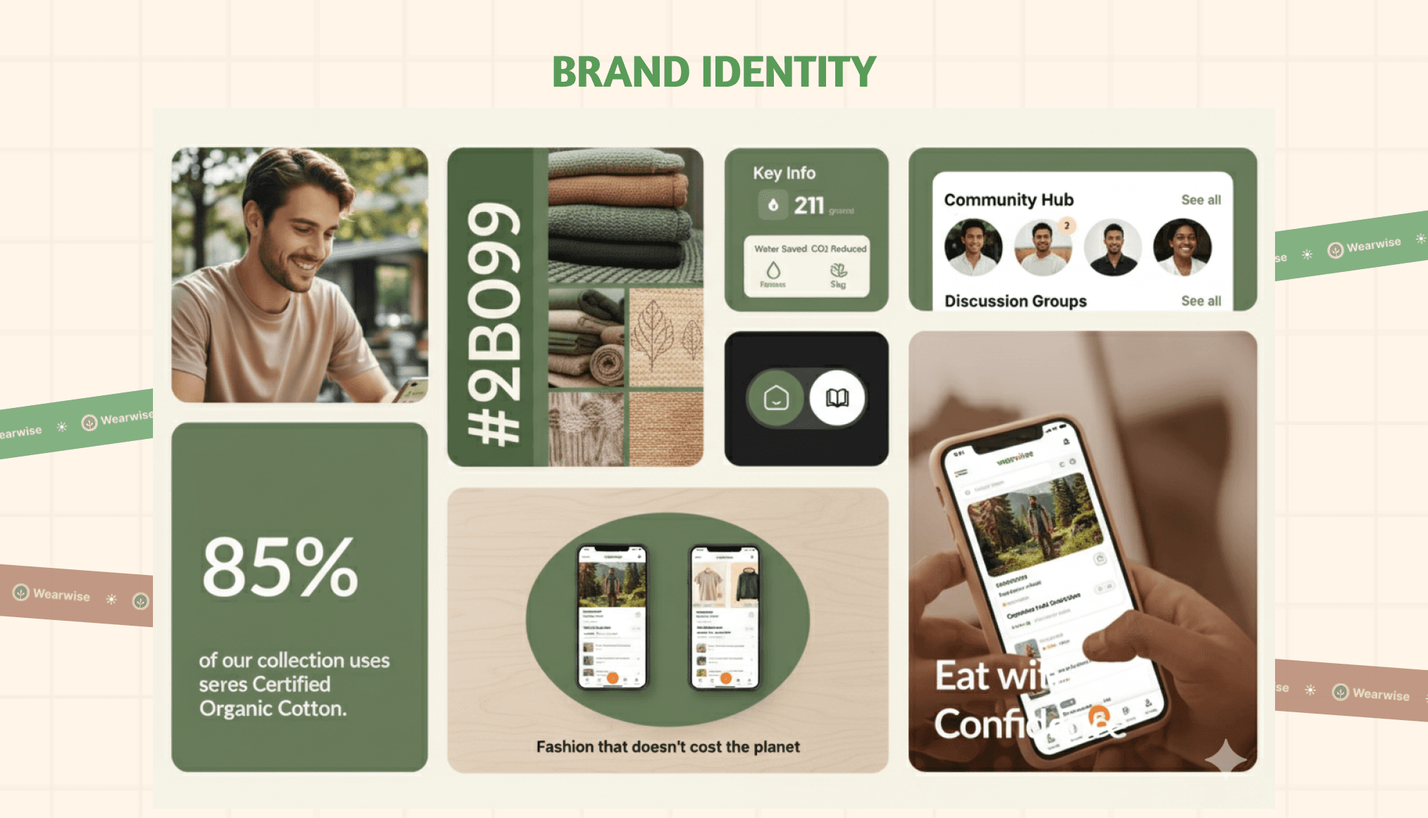
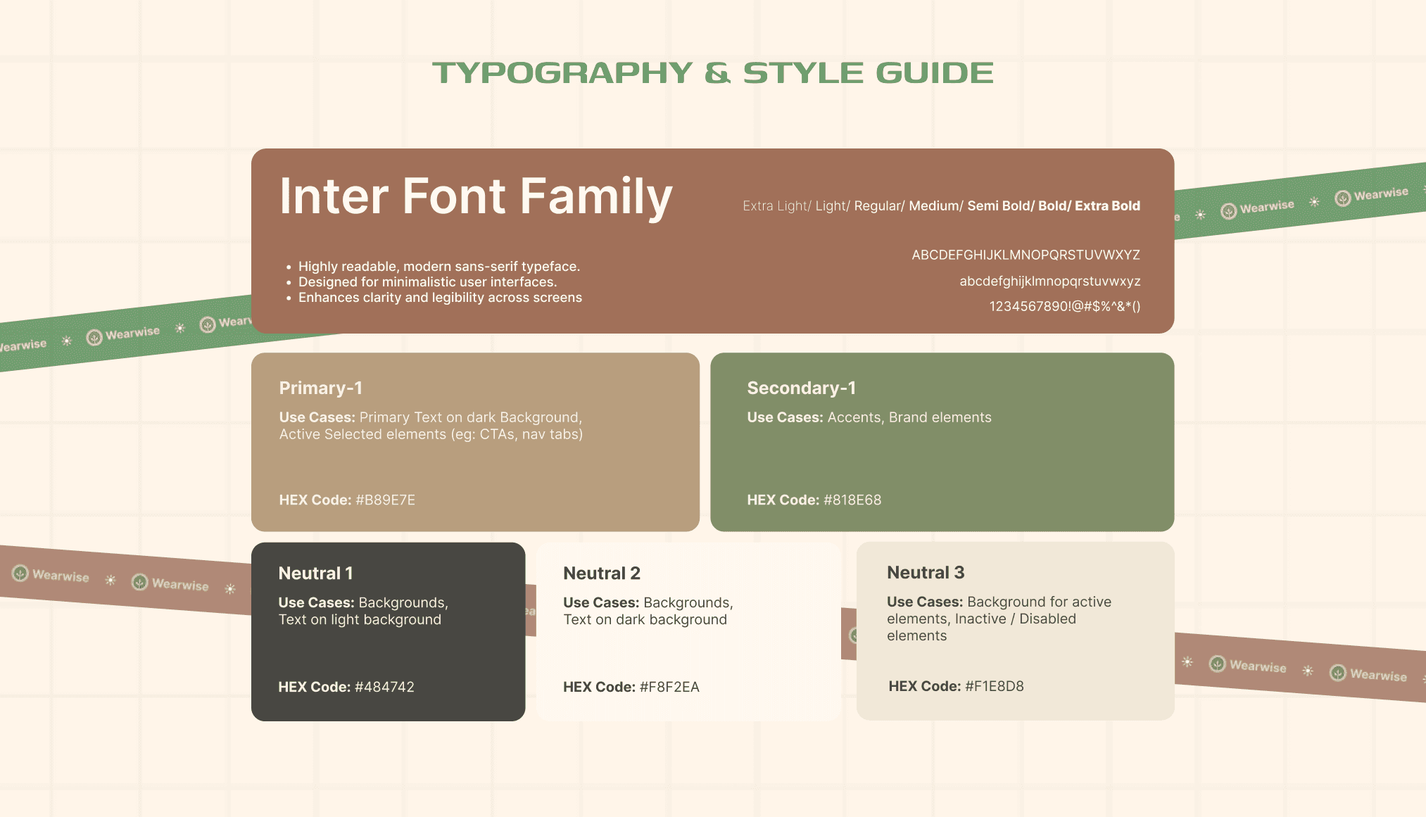
The UI & Branding
The interface intentionally mirrors mainstream fashion platforms to reduce learning friction. Visual hierarchy remains commerce-first, with sustainability signals kept minimal and transparent. Branding is calm and neutral, building trust through clarity instead of persuasion. Nothing competes with decision-making.

Impact & Takeaways
Wearwise demonstrates how UX can translate abstract values into real behavior. By reducing cognitive load, the system is designed to increase trust, reduce drop-offs, and improve conversion for sustainable products.
Key learning: ethical choices scale only when they feel effortless.
Impact would be measured through:
Increased conversion on sustainable products
Reduced drop-off during filtering and comparison
Higher trust and perceived transparency
Longer engagement with eco-friendly options
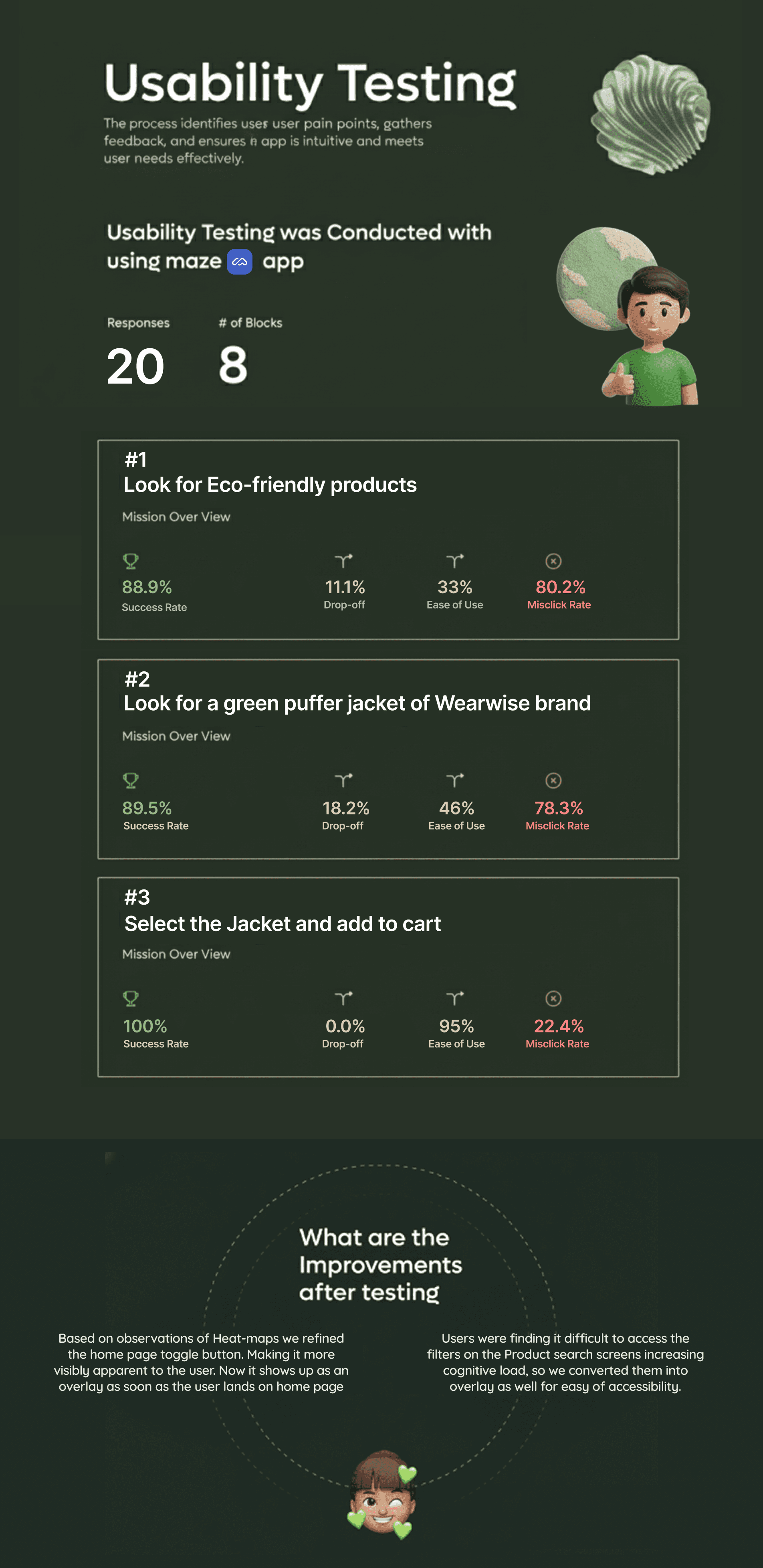
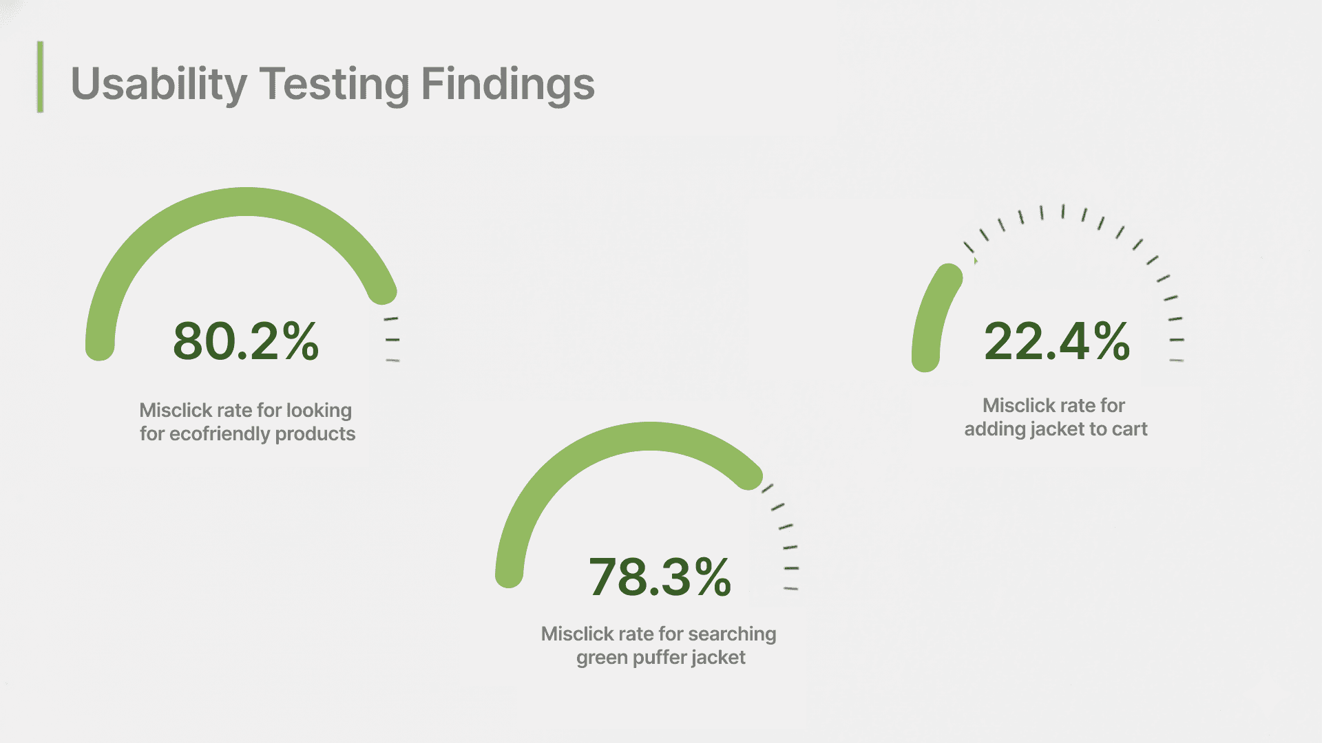
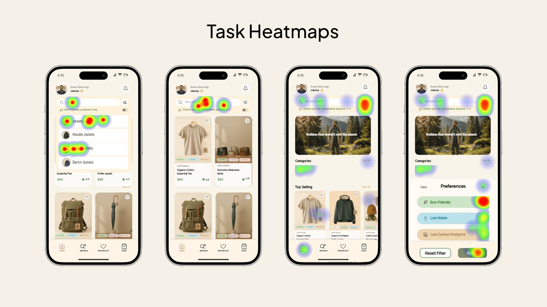
Usability Testing + Iterations
WEARWISE
Project headline
Simplifying sustainable fashion decisions
Context
E-commerce · B2C · Mobile / Web
Role
UX/UI Designer · Systems → UI
The Project Overview
Wearwise started from a simple tension I noticed in sustainable fashion: people want to shop responsibly, but the experience often feels confusing and heavy.
Working along with my teammate, I designed Wearwise as a mobile-first fashion marketplace that makes sustainability easier to act on without changing how people normally shop.
As part of our bootcamp project working as UX/UI Designer, we owned the project end-to-end — from research and system design to the final interface.
The Problem Definition
While sustainability information is everywhere, it often increases cognitive load instead of reducing it.
Labels like “eco,” “green,” or “conscious” feel vague and marketing-driven, making comparison difficult.
Users want to make sustainable choices, but uncertainty and distrust leads to hesitation and abandoned purchases. So, The core problem became clear:
"How do we support users in making sustainable decisions without slowing them down or making shopping feel complicated?"
The User Journey
Mapping the journey showed a clear breakdown point. Users entered with good intent, tried to interpret sustainability labels, began comparing without context, and slowly lost certainty.
Instead of moving forward, they paused — and often exited without purchasing. The issue wasn’t motivation, but decision paralysis during product discovery.
The Research Process
To validate whether this confusion was real, I worked in a team of two and conducted a quantitative survey with 30+ respondents, followed by 6 in-depth interviews.
We also analyzed 5 major fashion and sustainability platforms to study how sustainability information is currently presented.
Across methods, the same pattern emerged — users cared, but didn’t know how to act with confidence.
The Opportunities Discovered
Research revealed that users didn’t want to be educated while shopping. They wanted clarity, control, and speed.
Sustainability needed to behave like a preference — not a lesson. If users could define what sustainability meant to them, confidence and momentum could return to the shopping flow.
The Decisions Taken
Based on this insight, we designed Wearwise as a decision-support layer within a familiar e-commerce experience.
A sustainability toggle was placed directly below search, opening a simple overlay where users could select preferences like eco-friendly materials, low water usage, or low carbon footprint.
These preferences integrated seamlessly with existing filters like price, brand, material of product.
The Experience Created
The experience feels like any modern fashion app first. Sustainability stays visible prominently on the Home screen.
Once activated, it becomes clear, actionable, and comparable — guiding better decisions without interrupting shopping momentum.
Users remain in control, and sustainability supports decisions rather than slowing them down.
The UI & Branding
The interface intentionally mirrors mainstream fashion platforms to reduce learning friction. Visual hierarchy remains commerce-first, with sustainability signals kept minimal and transparent. Branding is calm and neutral, building trust through clarity instead of persuasion. Nothing competes with decision-making.
Impact & Takeaways
Wearwise demonstrates how UX can translate abstract values into real behavior. By reducing cognitive load, the system is designed to increase trust, reduce drop-offs, and improve conversion for sustainable products.
Key learning: ethical choices scale only when they feel effortless.
Impact would be measured through:
Increased conversion on sustainable products
Reduced drop-off during filtering and comparison
Higher trust and perceived transparency
Longer engagement with eco-friendly options
Usability Testing + Iterations
01
02
03

see also