
year
2025
year
2025
timeframe
4 weeks
timeframe
4 weeks
industry
Social Networking
industry
Social Networking
category
UI/UX
category
UI/UX
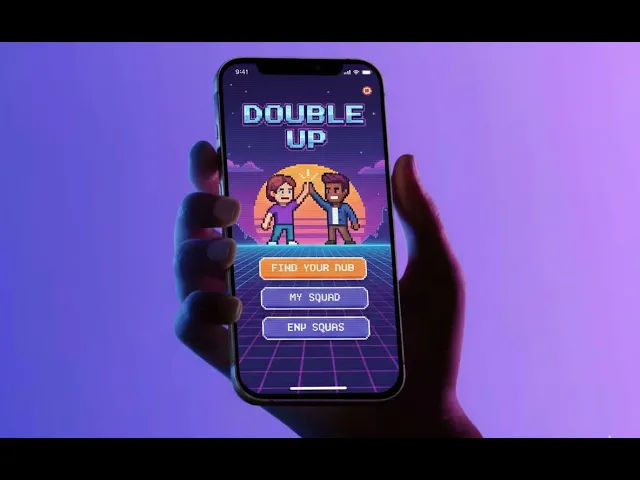
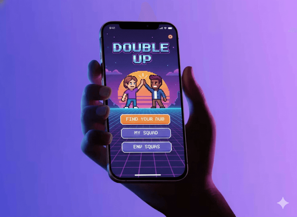
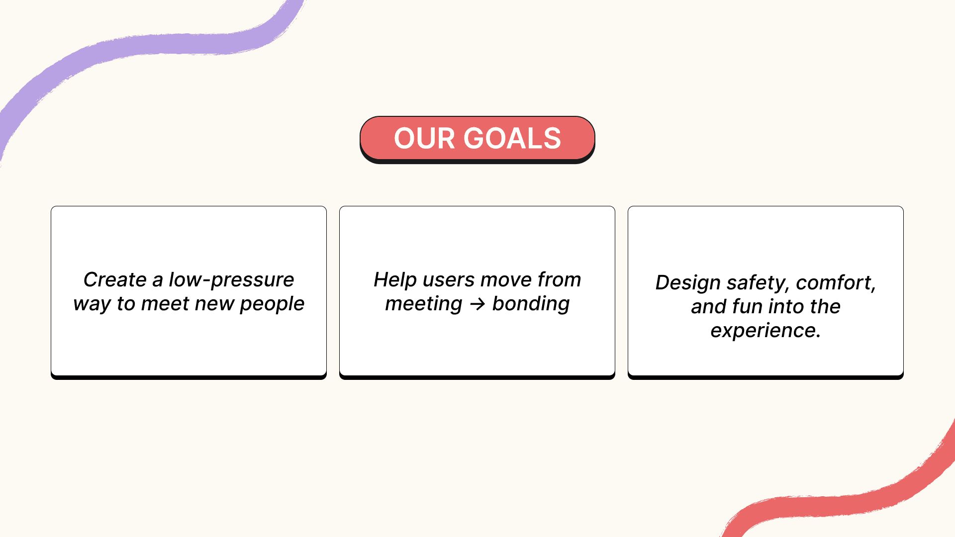
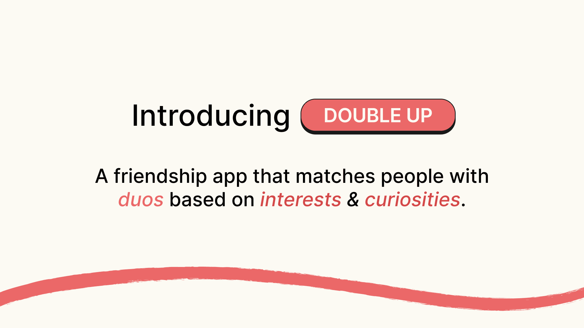
Double Up is a friendship app that helps adults form meaningful connections by matching people through shared interests - encouraging safe, low-pressure, real-world meetups in small groups.
DOUBLE UP
Project headline
Designing safer, low-pressure ways to make real friends
Context
Social · B2C · Mobile · Gamified
Role
UX/UI Designer · Concept → UI
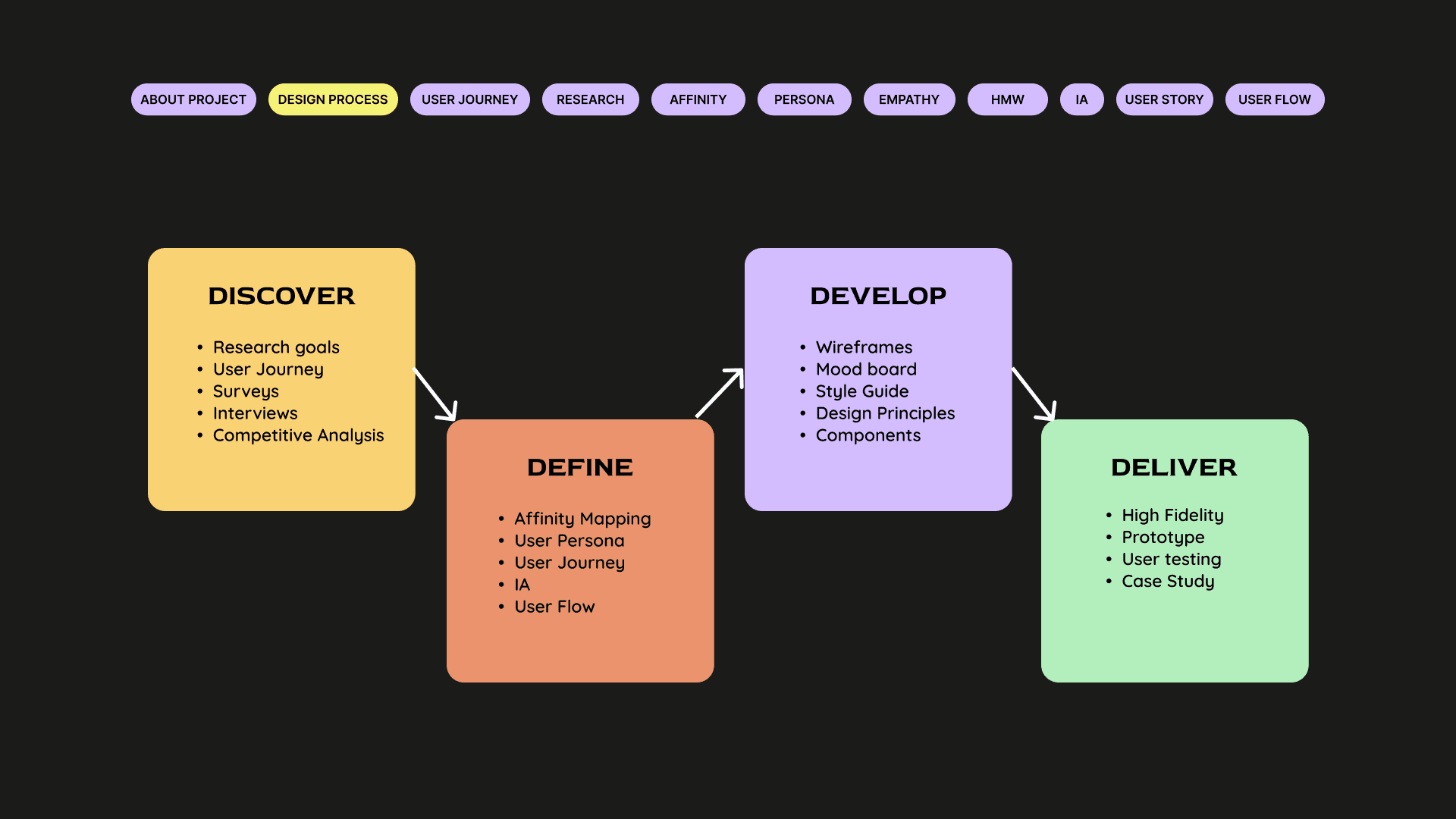
1. Context & Motivation
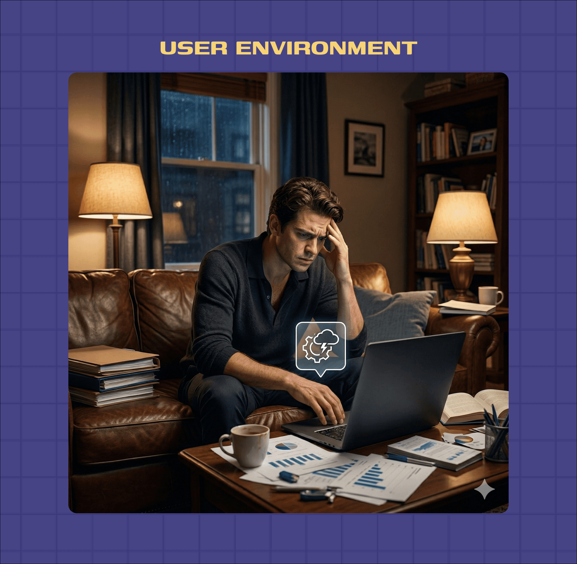
As adults, our social circles shrink while our desire for meaningful connection grows. Unlike college or school environments, modern adult life offers very few organic spaces to make new friends.
This project began with a simple but powerful question:
What if meeting new people felt as safe and comfortable as meeting an old friend?
Double Up was designed to move people away from passive digital interactions and toward real-world connection — without pressure, judgment, or social exhaustion.
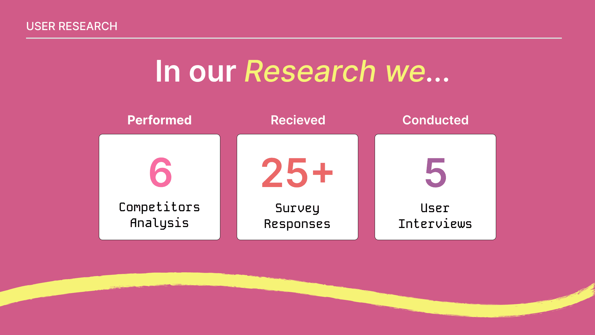
2. Research & Exploration
To ground the idea in real behavior, we conducted focused exploratory research.
What we did
Competitive analysis of 6 friendship & social apps
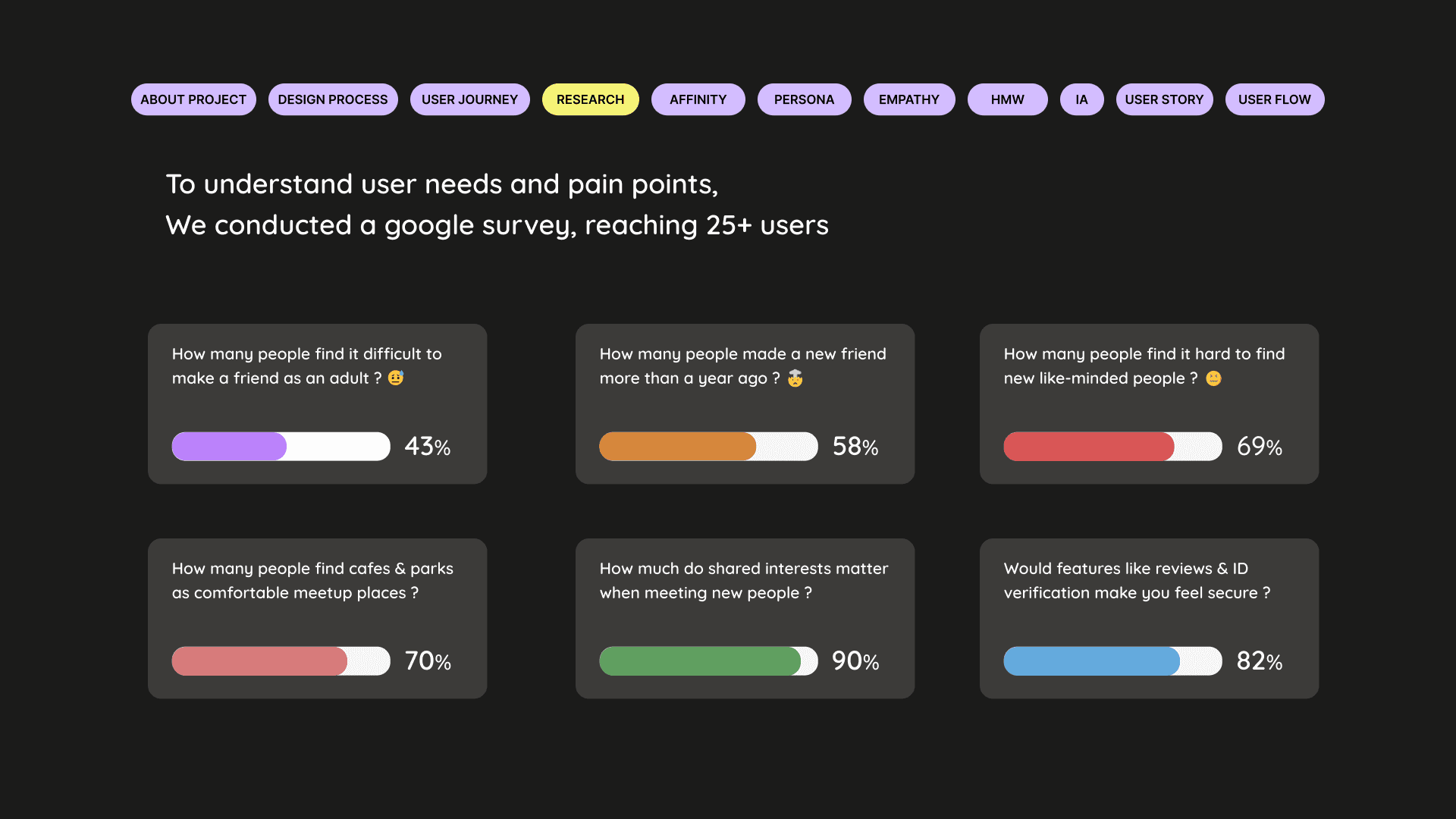
25+ survey responses to understand adult friendship challenges
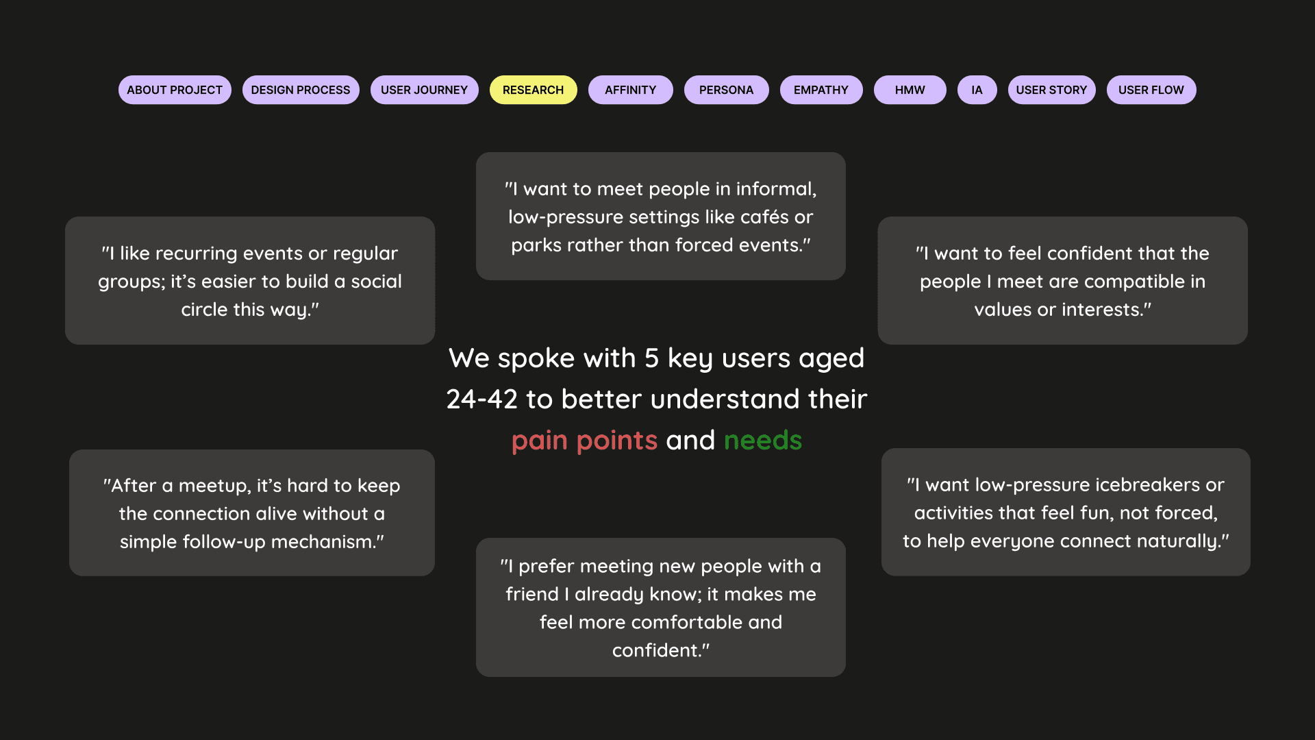
5 in-depth user interviews
Analysis of drop-off points after first meetups
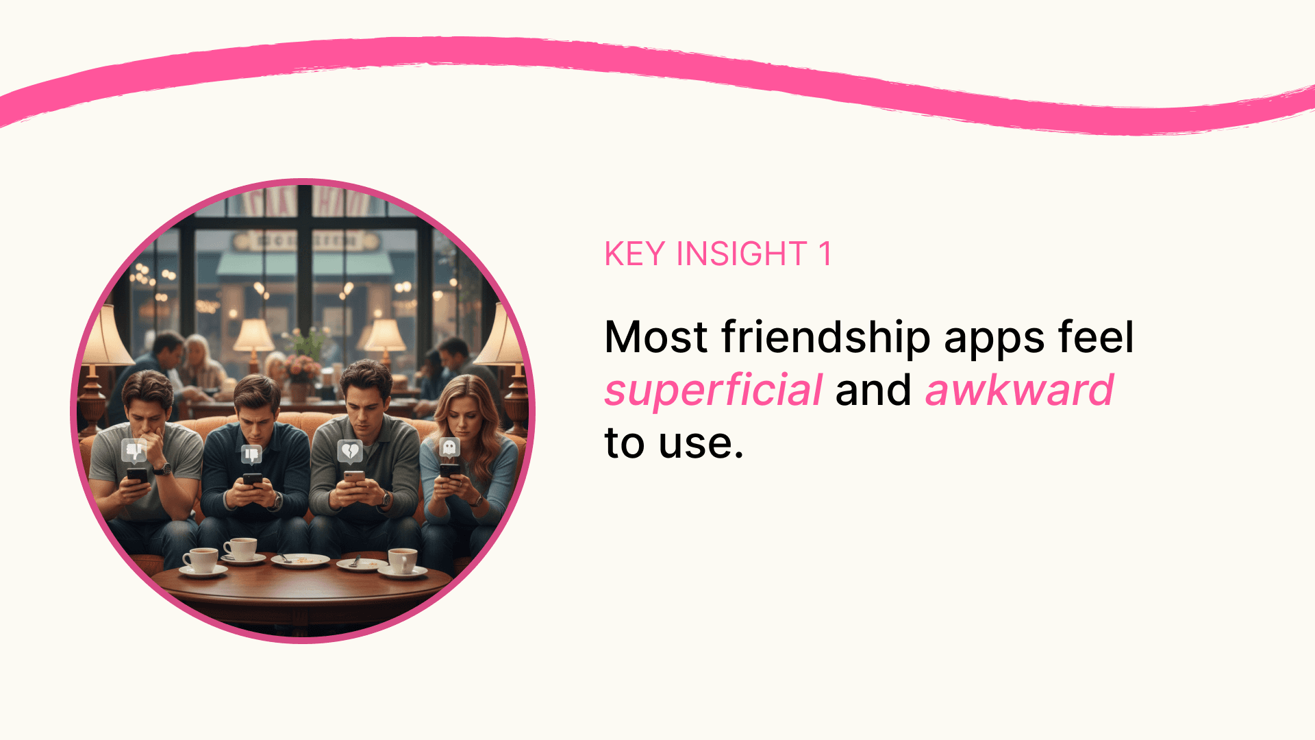
Key findings
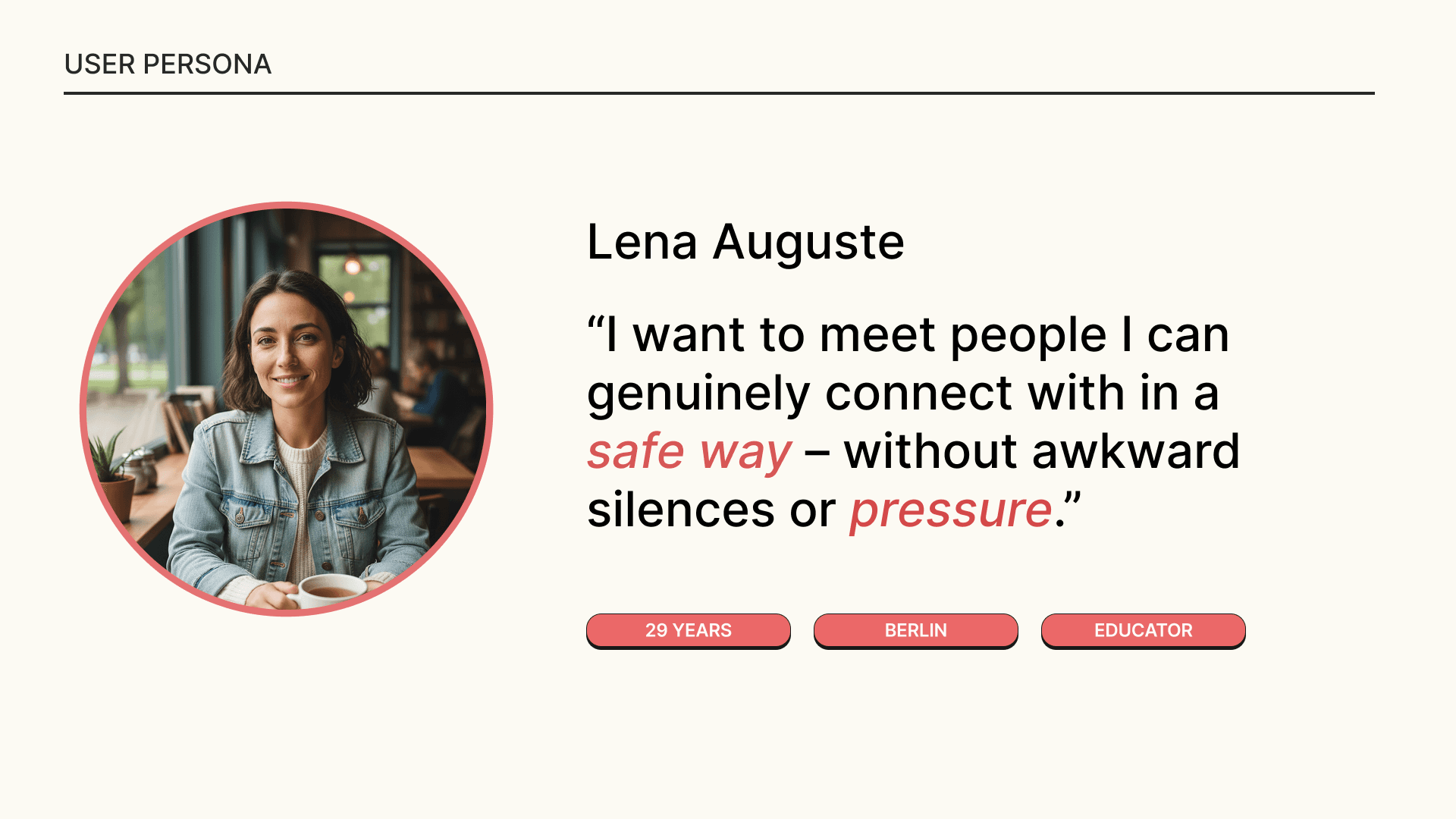
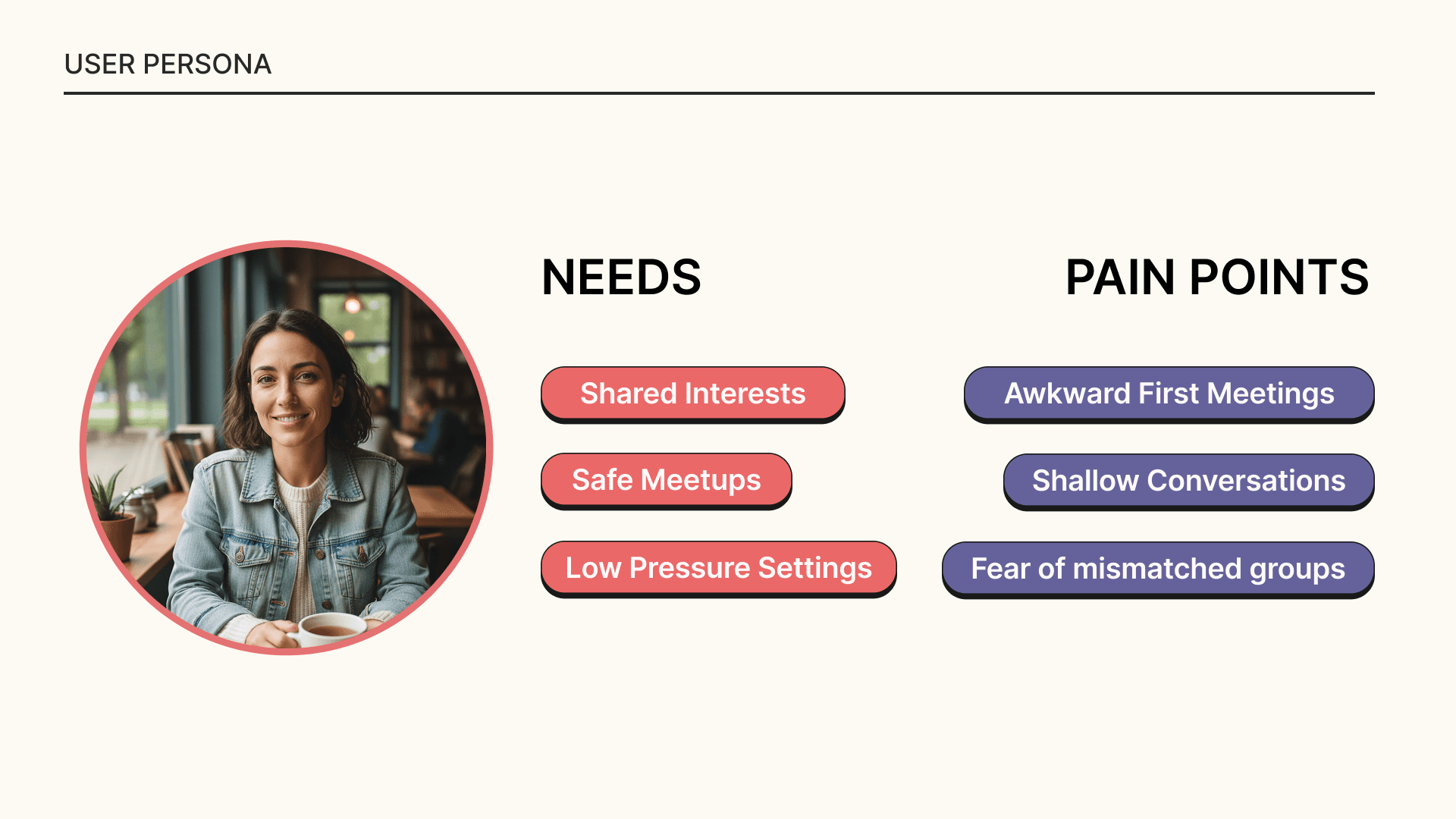
Friendship apps often feel superficial and awkward
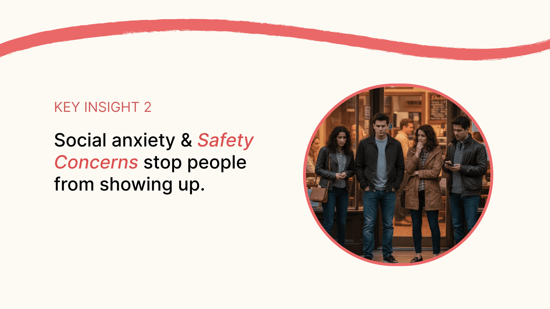
Users feel anxious about showing up alone
Safety and trust are major blockers
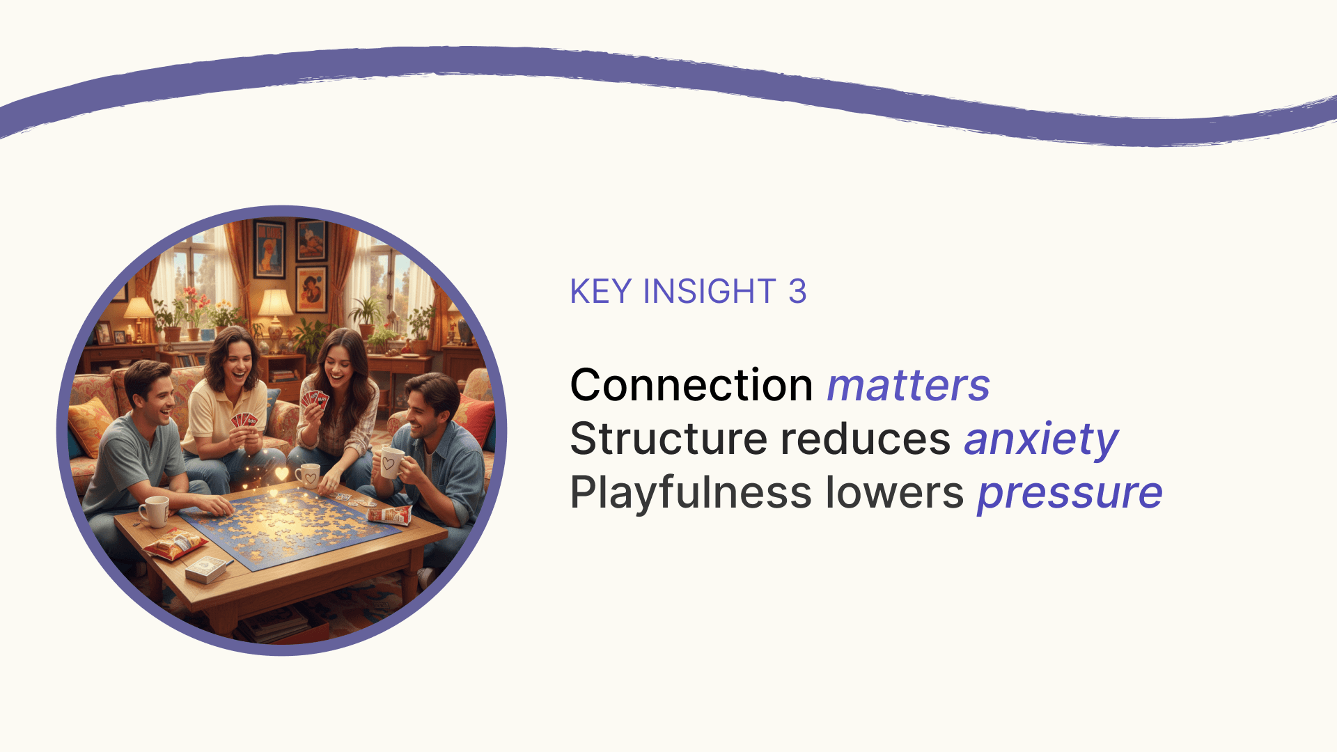
Structure helps people relax
Playfulness lowers social pressure
These insights directly informed the system design.
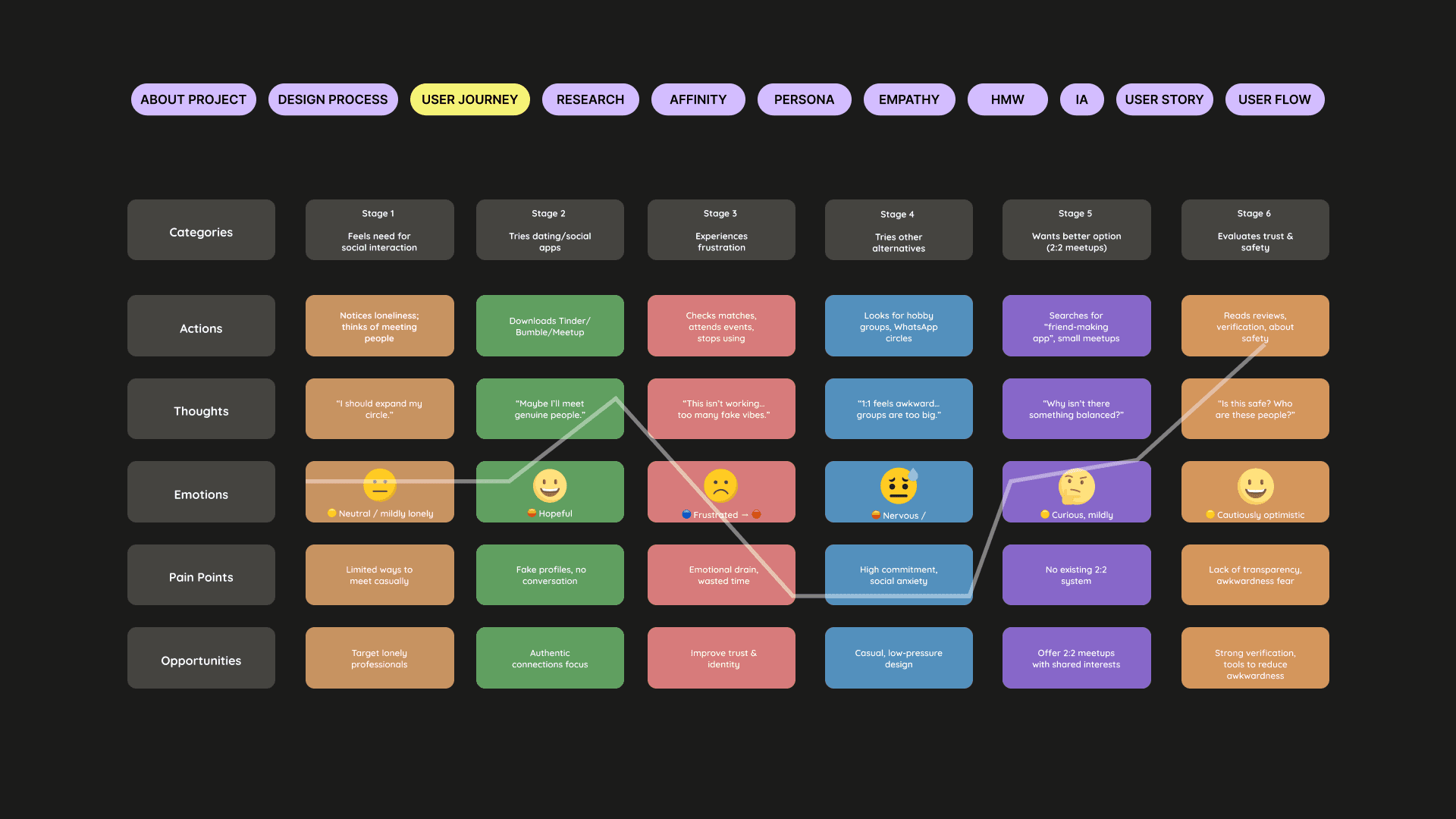
3. User Journey & Discovery Flow
I mapped the end-to-end journey from intention to real-world connection
Typical current journey
User wants new friends
Downloads an app
Chats endlessly or meets once
Awkward interaction → no follow-up
App abandoned
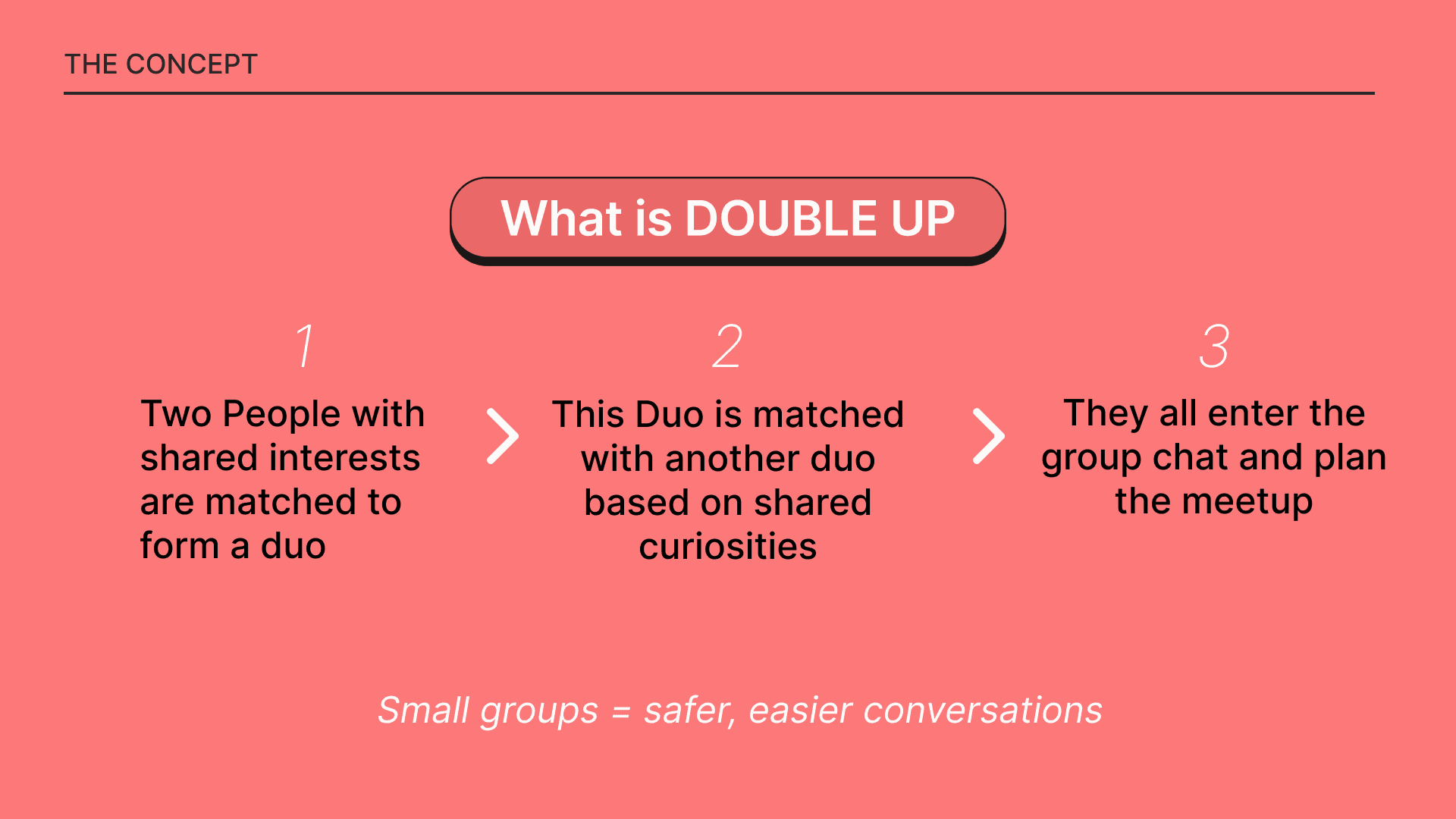
With Double Up
User onboards & selects interests
Matches with one person to form a duo
Duo pairs with another duo via shared curiosities
Group chats → meetup planned
Safe, structured in-person interaction
Post-meetup reflection & rewards
The journey is designed to reduce anxiety at every step.
4. Key Insights
Research revealed that:
Most friendship apps feel forced and superficial
Showing up alone increases social anxiety
Smaller groups feel safer and more natural
Shared activities reduce awkward silence
Playful structure helps people open up
These insights shaped both UX and interaction patterns.
5. UX System Design
Double Up was designed as a connection-first system, not a chat app.
Core UX decisions
Match two people into a duo before group formation
Pair duos based on shared curiosities, not just interests
Small groups (4 people) for comfort and safety
Built-in structure for moving from chat → meetup
Safety features integrated, not hidden
The system supports bonding, not endless messaging.
6. UI Design & Approach
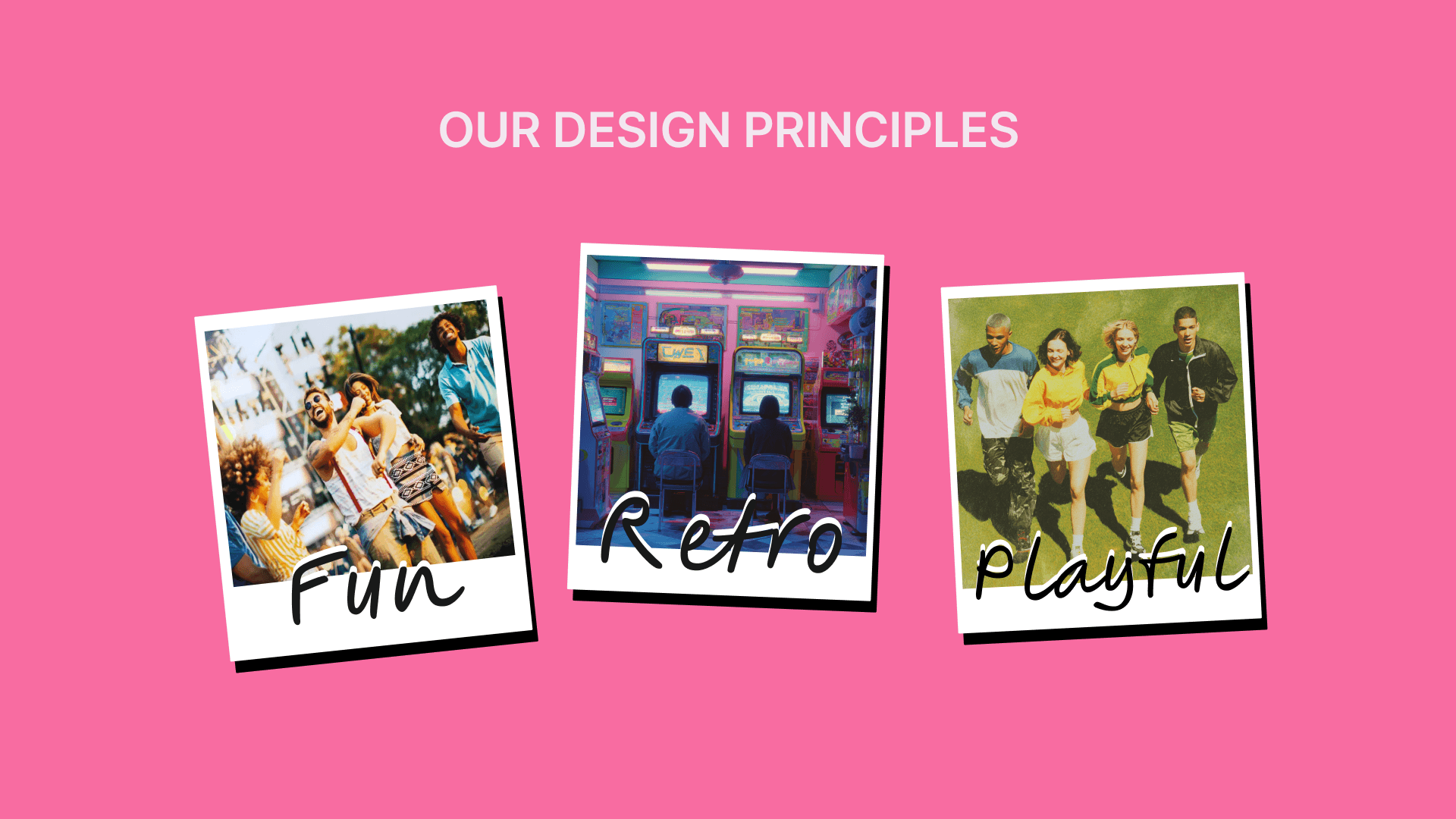
The interface reflects the emotional tone of the product.
Design principles
Fun – playful interactions and rewards
Retro – nostalgic visual cues to reduce seriousness
Playful – gamified elements to lower pressure
UI decisions
Friendly onboarding with energy-level selection
Interest & curiosity-based matching screens
Icebreaker prompts to ease conversation
Gamified rewards (badges, levels) post meetup
The UI helps users relax and enjoy the experience.
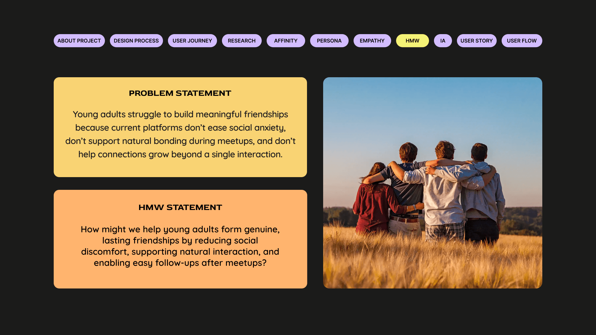
7. Final Solution & Impact
Double Up transforms how adults form friendships by making real-world connection safer, lighter, and more human.
Impact
Reduces social anxiety around first meetups
Encourages real-world interaction over endless chatting
Builds trust through small-group dynamics
Turns meetups into memorable experiences
If scaled, Double Up could become a new model for intentional, offline-first social connection.
DOUBLE UP
Project headline
Designing safer, low-pressure ways to make real friends
Context
Social · B2C · Mobile · Gamified
Role
UX/UI Designer · Concept → UI
1. Context & Motivation
As adults, our social circles shrink while our desire for meaningful connection grows. Unlike college or school environments, modern adult life offers very few organic spaces to make new friends.
This project began with a simple but powerful question:
What if meeting new people felt as safe and comfortable as meeting an old friend?
Double Up was designed to move people away from passive digital interactions and toward real-world connection — without pressure, judgment, or social exhaustion.
2. Research & Exploration
To ground the idea in real behavior, we conducted focused exploratory research.
What we did
Competitive analysis of 6 friendship & social apps
25+ survey responses to understand adult friendship challenges
5 in-depth user interviews
Analysis of drop-off points after first meetups
Key findings
Friendship apps often feel superficial and awkward
Users feel anxious about showing up alone
Safety and trust are major blockers
Structure helps people relax
Playfulness lowers social pressure
These insights directly informed the system design.
3. User Journey & Discovery Flow
I mapped the end-to-end journey from intention to real-world connection
Typical current journey
User wants new friends
Downloads an app
Chats endlessly or meets once
Awkward interaction → no follow-up
App abandoned
With Double Up
User onboards & selects interests
Matches with one person to form a duo
Duo pairs with another duo via shared curiosities
Group chats → meetup planned
Safe, structured in-person interaction
Post-meetup reflection & rewards
The journey is designed to reduce anxiety at every step.
4. Key Insights
Research revealed that:
Most friendship apps feel forced and superficial
Showing up alone increases social anxiety
Smaller groups feel safer and more natural
Shared activities reduce awkward silence
Playful structure helps people open up
These insights shaped both UX and interaction patterns.
5. UX System Design
Double Up was designed as a connection-first system, not a chat app.
Core UX decisions
Match two people into a duo before group formation
Pair duos based on shared curiosities, not just interests
Small groups (4 people) for comfort and safety
Built-in structure for moving from chat → meetup
Safety features integrated, not hidden
The system supports bonding, not endless messaging.
6. UI Design & Approach
The interface reflects the emotional tone of the product.
Design principles
Fun – playful interactions and rewards
Retro – nostalgic visual cues to reduce seriousness
Playful – gamified elements to lower pressure
UI decisions
Friendly onboarding with energy-level selection
Interest & curiosity-based matching screens
Icebreaker prompts to ease conversation
Gamified rewards (badges, levels) post meetup
The UI helps users relax and enjoy the experience.
7. Final Solution & Impact
Double Up transforms how adults form friendships by making real-world connection safer, lighter, and more human.
Impact
Reduces social anxiety around first meetups
Encourages real-world interaction over endless chatting
Builds trust through small-group dynamics
Turns meetups into memorable experiences
If scaled, Double Up could become a new model for intentional, offline-first social connection.
see also