
year
2025
year
2025
timeframe
2 weeks
timeframe
2 weeks
industry
Wellness & Healthcare
industry
Wellness & Healthcare
category
UI/UX
category
UI/UX
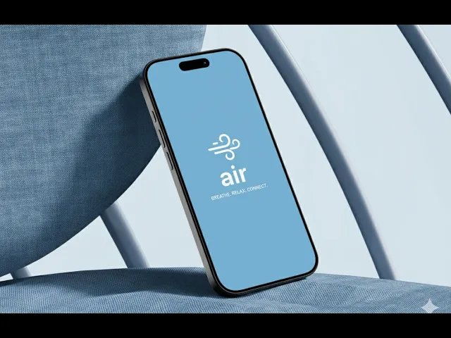
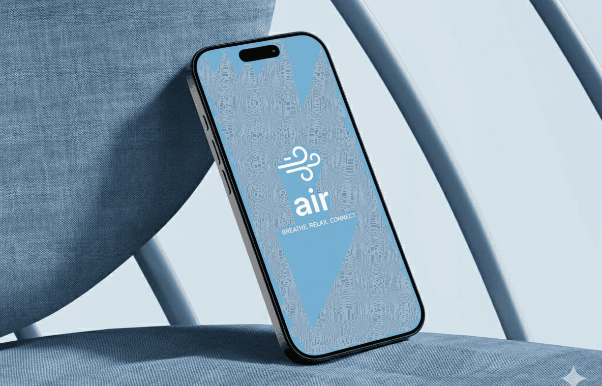
A mindfulness app that helps students and working professionals decompress during short breaks through guided breathing, nature-based experiences, and real-world connection.
AIR
Project headline
Encouraging mindful breaks to reduce work burnout
Context
Mental Wellbeing · B2C · Mobile
Role
UX/UI Designer · Research → UX
The Project Overview
Air began with a simple observation: "People rarely pause until they’re already exhausted." The app was designed as a mental wellbeing companion that helps users take short, meaningful breaks during the workday through - breathing, light movement, and optional outdoor activity.
The project started as a team concept with 5 members focused on research and ideation, after which I independently carried the product forward, shaping the final interface. The goal was not deep meditation, but realistic mental reset moments that fit into real work schedules.
The Problem Definition
While burnout is widely acknowledged, most people ignore break reminders during work. Existing mindfulness apps often require time, setup, or emotional readiness that users don’t have mid-day. This leads to guilt-driven avoidance, screen fatigue, and continued mental overload. The core problem became clear:
"How do we encourage people to take breaks they don’t resist — without adding pressure, commitment, or disruption to their workflow?"
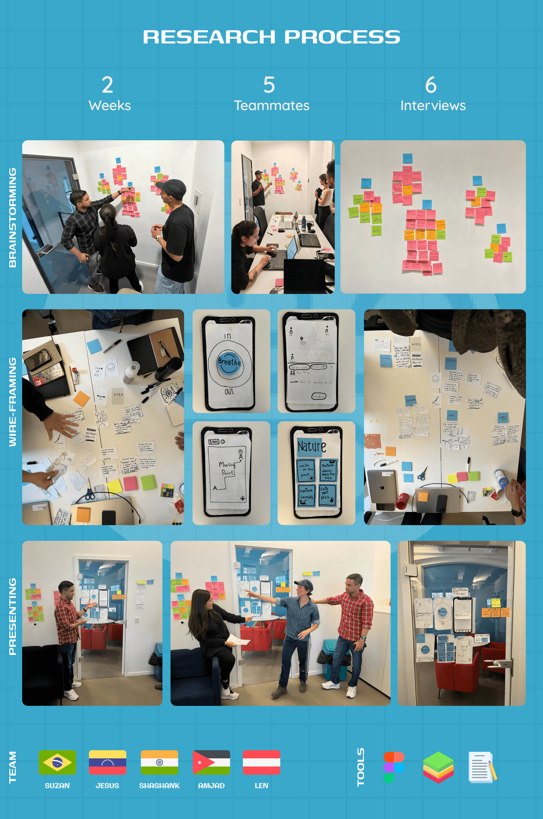
The Research Process
To ground the problem in real behavior, research focused on observation and usage patterns rather than long-form studies.
We observed student and professional routines, identified stress spikes between meetings and tasks, and reviewed how existing mindfulness apps are actually used during workdays.
User interviews and short surveys revealed that people weren’t unaware of breaks — they avoided them due to inertia, guilt, and the lack of an immediately rewarding reason to step away.
The Opportunities Discovered
Research showed that users respond best to immediate calm, not structured programs. Breathing helps reset attention quickly, nature-based experiences feel grounding, and choice reduces resistance during stress.
Social interaction worked only when optional and local, never forced. These insights pointed toward a system that supports emotional states in the moment rather than prescribing routines or long-term goals.
The Decisions Taken
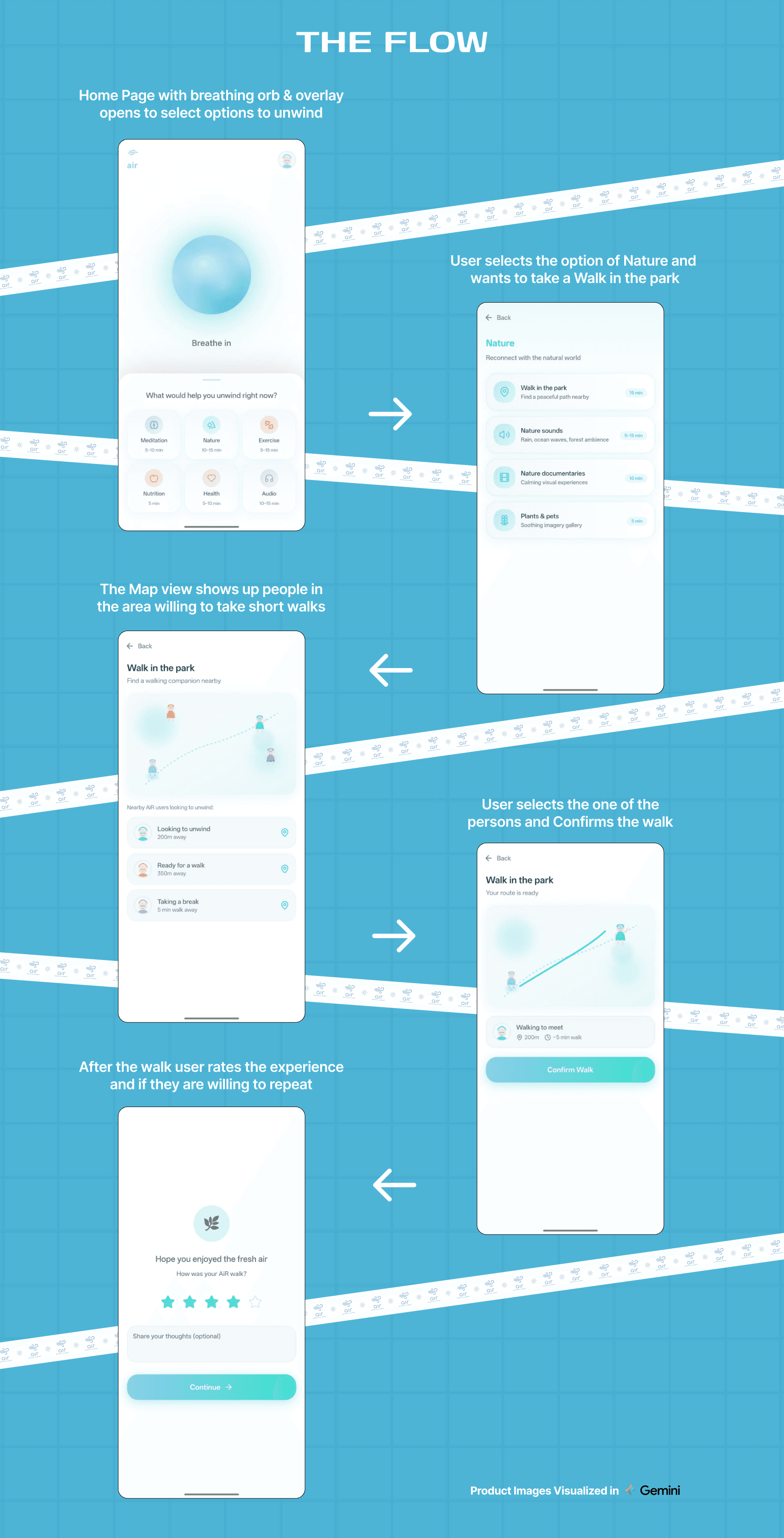
Based on these insights, Air was designed as a modular relaxation system instead of a linear wellness journey.
The experience begins with grounding, then allows users to choose what helps them unwind — breathing, short walks, or quiet reflection.
Sessions are intentionally short and interruptible, and real-world interaction is offered as an option, not a requirement.
The system adapts to how the user feels, rather than asking the user to adapt to the app.
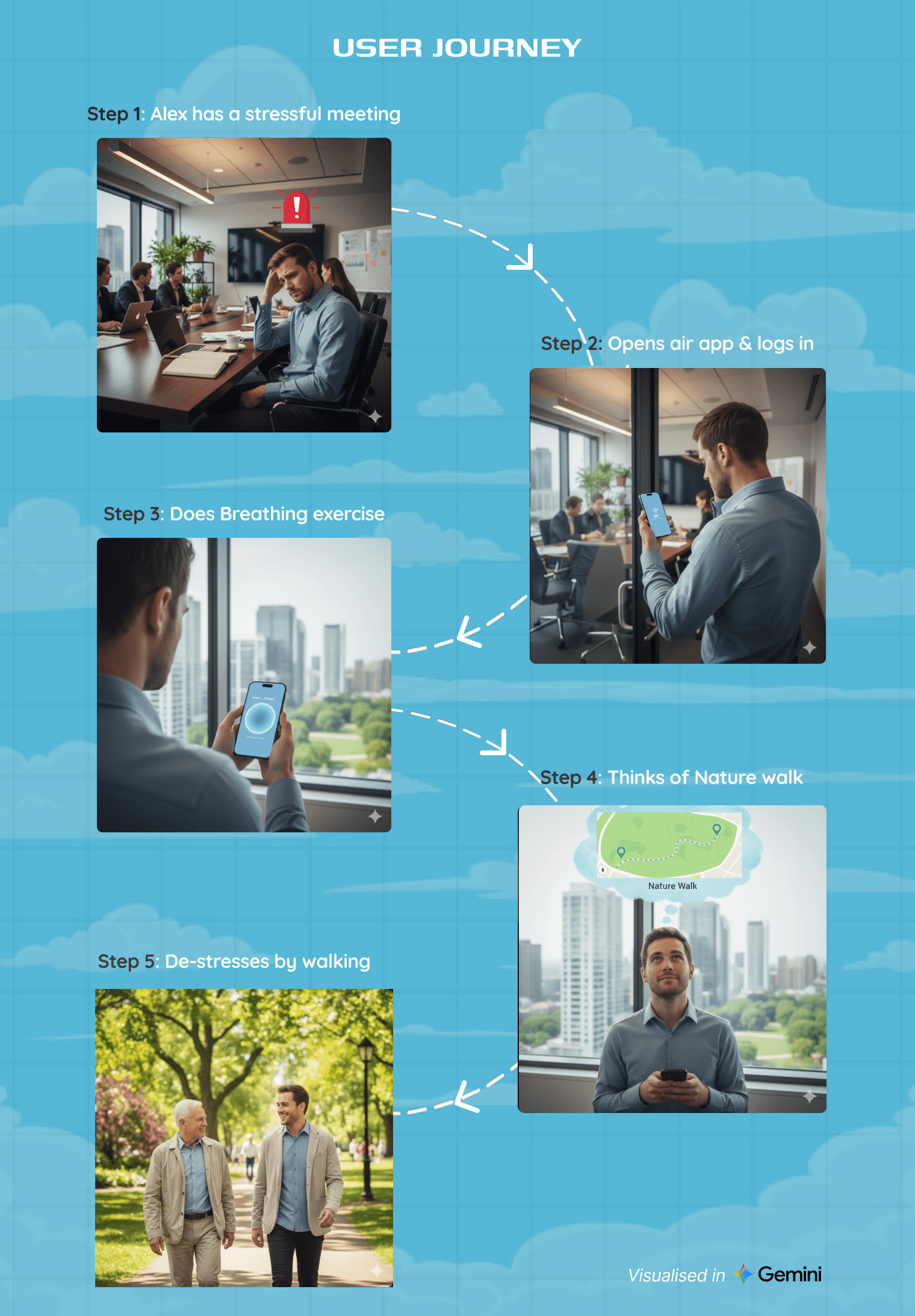
The User Journey
Mapping a realistic break-time journey helped place Air naturally into a user’s day. A working professional leaves a stressful meeting, opens the app during a short break, and needs calm immediately — not after configuration.
The journey starts with grounding, then offers choice, and ends without obligation. This flow highlighted that entry and exit moments mattered more than duration, and that control had to remain with the user throughout the experience.
The Experience Created
Using Air feels calm, lightweight, and pressure-free. Users open the app, start with a brief breathing moment, and then decide how they want to reset.
The experience supports stepping away from the screen rather than keeping users inside it. Each interaction is designed to help users exit calmer than they entered, without asking for commitment, streaks, or performance.
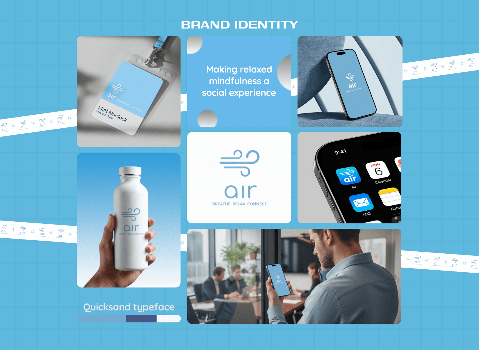
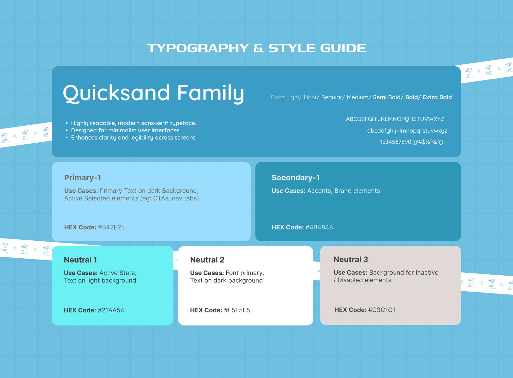
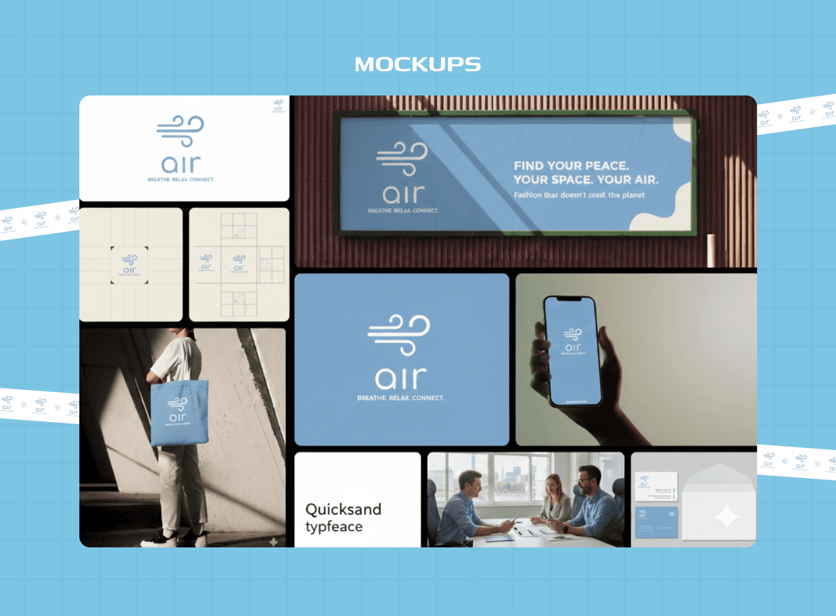
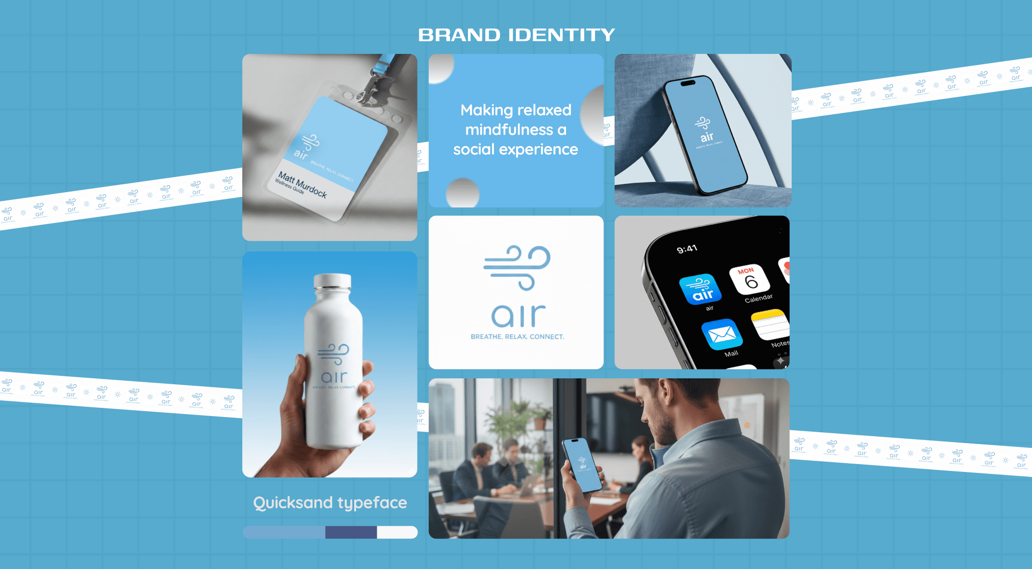
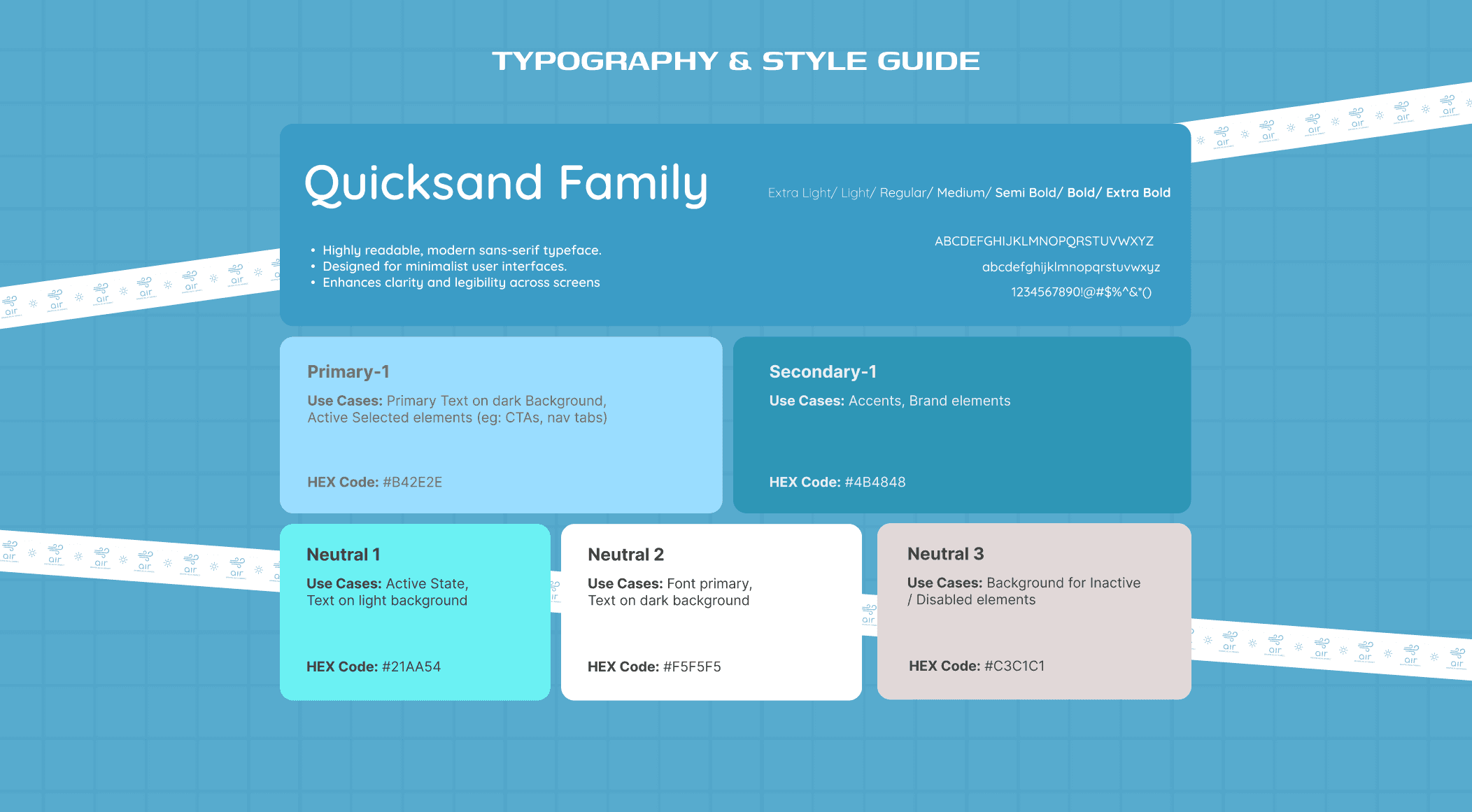
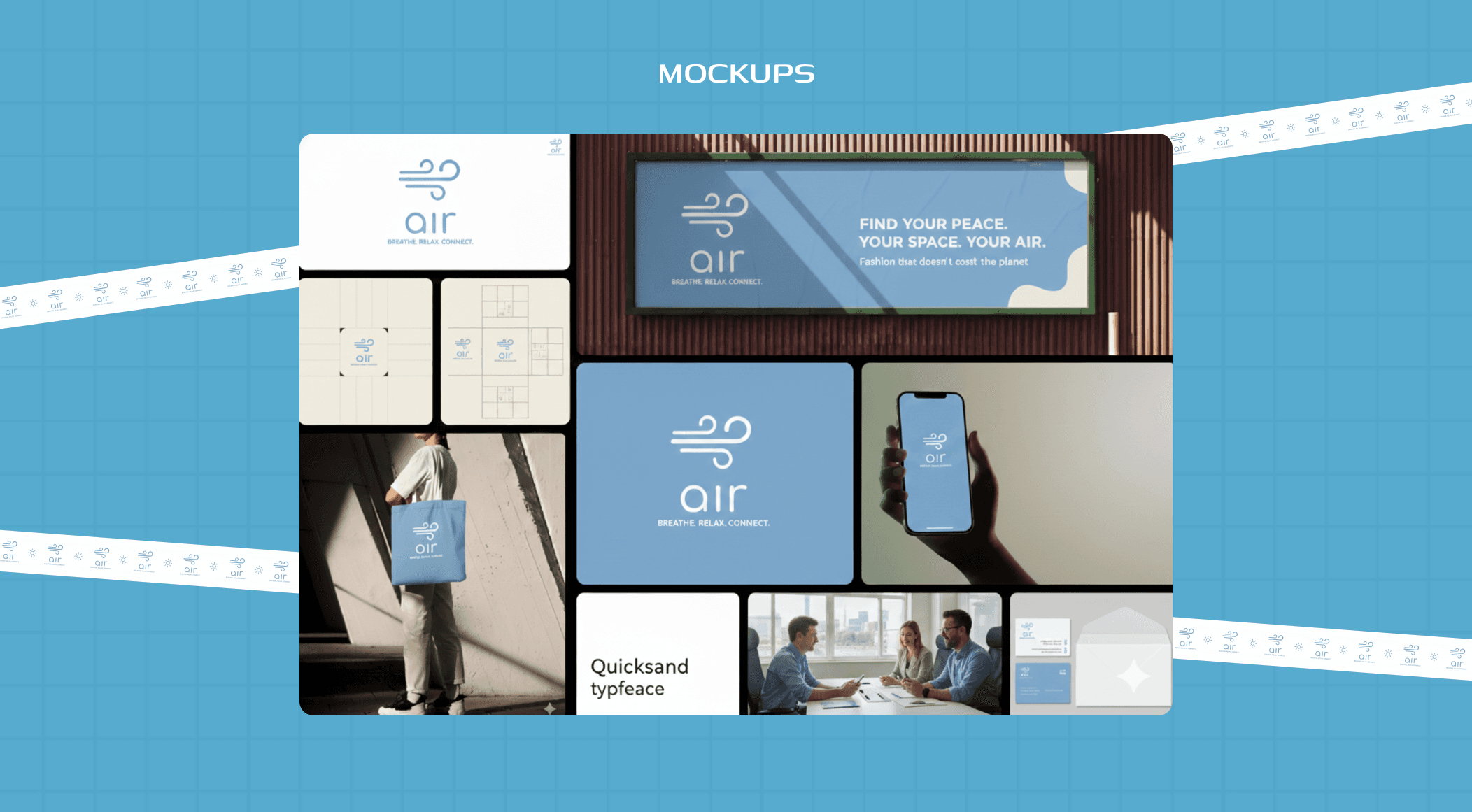
The UI & Branding
The interface is intentionally minimal and emotionally soft to convery the relaxing air feeling.
Slow animations, organic shapes, and nature-inspired colors reduce stimulation, while minimal text and reassuring microcopy keep cognitive load low.
Spacious layouts and clear hierarchy support mental decompression rather than engagement. The visual language reinforces Air’s purpose: not productivity, but permission to pause.
The Impact & Takeaways
Air reframes wellness as something that fits into real workdays, not something users must schedule around life. The concept supports reduced stress between tasks, improved emotional regulation, and healthier break behavior. Impact would be measured through session completion, return usage during work hours, and perceived calm after use.
Key learning: wellbeing products work best when they remove guilt instead of adding goals.
AIR
Project headline
Encouraging mindful breaks to reduce work burnout
Context
Mental Wellbeing · B2C · Mobile
Role
UX/UI Designer · Research → UX
The Project Overview
Air began with a simple observation: "People rarely pause until they’re already exhausted." The app was designed as a mental wellbeing companion that helps users take short, meaningful breaks during the workday through - breathing, light movement, and optional outdoor activity.
The project started as a team concept with 5 members focused on research and ideation, after which I independently carried the product forward, shaping the final interface. The goal was not deep meditation, but realistic mental reset moments that fit into real work schedules.
The Problem Definition
While burnout is widely acknowledged, most people ignore break reminders during work. Existing mindfulness apps often require time, setup, or emotional readiness that users don’t have mid-day. This leads to guilt-driven avoidance, screen fatigue, and continued mental overload. The core problem became clear:
"How do we encourage people to take breaks they don’t resist — without adding pressure, commitment, or disruption to their workflow?"
The Research Process
To ground the problem in real behavior, research focused on observation and usage patterns rather than long-form studies.
We observed student and professional routines, identified stress spikes between meetings and tasks, and reviewed how existing mindfulness apps are actually used during workdays.
User interviews and short surveys revealed that people weren’t unaware of breaks — they avoided them due to inertia, guilt, and the lack of an immediately rewarding reason to step away.
The Opportunities Discovered
Research showed that users respond best to immediate calm, not structured programs. Breathing helps reset attention quickly, nature-based experiences feel grounding, and choice reduces resistance during stress.
Social interaction worked only when optional and local, never forced. These insights pointed toward a system that supports emotional states in the moment rather than prescribing routines or long-term goals.
The Decisions Taken
Based on these insights, Air was designed as a modular relaxation system instead of a linear wellness journey.
The experience begins with grounding, then allows users to choose what helps them unwind — breathing, short walks, or quiet reflection.
Sessions are intentionally short and interruptible, and real-world interaction is offered as an option, not a requirement.
The system adapts to how the user feels, rather than asking the user to adapt to the app.
The User Journey
Mapping a realistic break-time journey helped place Air naturally into a user’s day. A working professional leaves a stressful meeting, opens the app during a short break, and needs calm immediately — not after configuration.
The journey starts with grounding, then offers choice, and ends without obligation. This flow highlighted that entry and exit moments mattered more than duration, and that control had to remain with the user throughout the experience.
The Experience Created
Using Air feels calm, lightweight, and pressure-free. Users open the app, start with a brief breathing moment, and then decide how they want to reset.
The experience supports stepping away from the screen rather than keeping users inside it. Each interaction is designed to help users exit calmer than they entered, without asking for commitment, streaks, or performance.
The UI & Branding
The interface is intentionally minimal and emotionally soft to convery the relaxing air feeling.
Slow animations, organic shapes, and nature-inspired colors reduce stimulation, while minimal text and reassuring microcopy keep cognitive load low.
Spacious layouts and clear hierarchy support mental decompression rather than engagement. The visual language reinforces Air’s purpose: not productivity, but permission to pause.
The Impact & Takeaways
Air reframes wellness as something that fits into real workdays, not something users must schedule around life. The concept supports reduced stress between tasks, improved emotional regulation, and healthier break behavior. Impact would be measured through session completion, return usage during work hours, and perceived calm after use.
Key learning: wellbeing products work best when they remove guilt instead of adding goals.
01
02
03
see also